Choose clear icons for your application
Icons help people recognize an action or state quickly. They work best beside clear words: an approval symbol with “Approved” is easier to understand than an unexplained green mark.
In most design tasks, begin with the visual icon picker in Properties. You do not need to know how Inflow packages icons internally.
Before you begin
Open the intended screen in the Interface Designer and select a control with an Icon or Title icon property. Different controls offer different icon settings. If a setting is not offered for that control, do not assume a hidden formula can make it work.
Choose icons by business meaning. A symbol beside a Section title does not create a task, approval, or document action; the supported control and its configured behavior remain separate.
Example — Give a leave section a recognizable icon
Nadia’s application has a Section titled Leave request details. She wants a document cue beside its heading while keeping the words clear.
- Select the Section and make sure its heading says Leave request details. The icon supports that label; it does not replace it.
- Open the Section’s Title icon property and choose Business icons.
- Search for
documentand inspect the actual Document option in the current catalogue. The picker also offers a category filter. - Choose Document and inspect the icon beside Leave request details in the selected Section.
- Preview the page. Check that the icon is readable at the intended size and the heading still explains what the section contains.
- Save and publish the intended screen change through its normal flow.
What you should see: the Section heading Leave request details with a small document symbol. The symbol is presentation; the Section’s text and the page’s actual actions continue to explain what people can do.
If no icon expresses the idea clearly, use good text. An elaborate symbol is not required for every action.
Example — Restore a section's default icon
Nadia tries a money-related icon on the leave information section, then realizes it suggests the wrong purpose.
- Select the section or card and open Title icon, where that control offers it.
- Review the current choice in the icon picker.
- Choose Reset to default to return to that control's default icon.
- Alternatively, use Clear selected icon when the intended design should have no selected icon.
- Preview the section with its actual title and content, then save the deliberate choice.
What you should see: a simple section header that does not mislead the reader. Resetting an icon changes presentation; it does not delete the section or change its data.
Practice — inspect a page icon without changing the saved app
Nadia has a saved practice app containing Home, Overview and Published example. A colleague sees a document symbol beside Published example and asks whether choosing an approval symbol would make the page approve requests. Nadia first opens the page's settings and checks what the icon actually represents. It is a visual cue beside a menu entry. The page still displays the interface chosen in its binding; changing the icon cannot replace that binding, submit a form or make an approval decision.
Use a synthetic practice app for this exercise. Reuse the one already created in the three-page app practice. You do not need to create another form, publish a release or run a workflow merely to learn the picker. Keep the current page title readable beside its icon.
The four pictures below were captured on 16 November 2026 from source 899ce1a1, using the approved designer in the synthetic practice workspace. The app remains an unpublished draft. They show picker inspection only; no icon replacement, approval, formula evaluation or publication was performed.
Start from the right page settings
- Open the intended saved App Shell in Designer and confirm its name. In this example it is App page practice.
- Select Published example in the Pages panel. A page in the application's navigation is different from a Section inside a form.
- Open that page's Page settings. Confirm the dialog title names Published example before using any field.
- Read Icon and its current visible choice. Also read the page Title so you can explain what the symbol sits beside.
- Leave the URL stub, visibility and displayed interface unchanged. These settings have different jobs and do not need to change to inspect an icon.
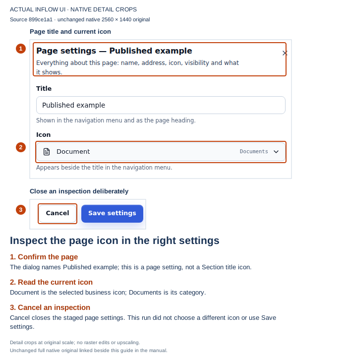
Open the unchanged native original.
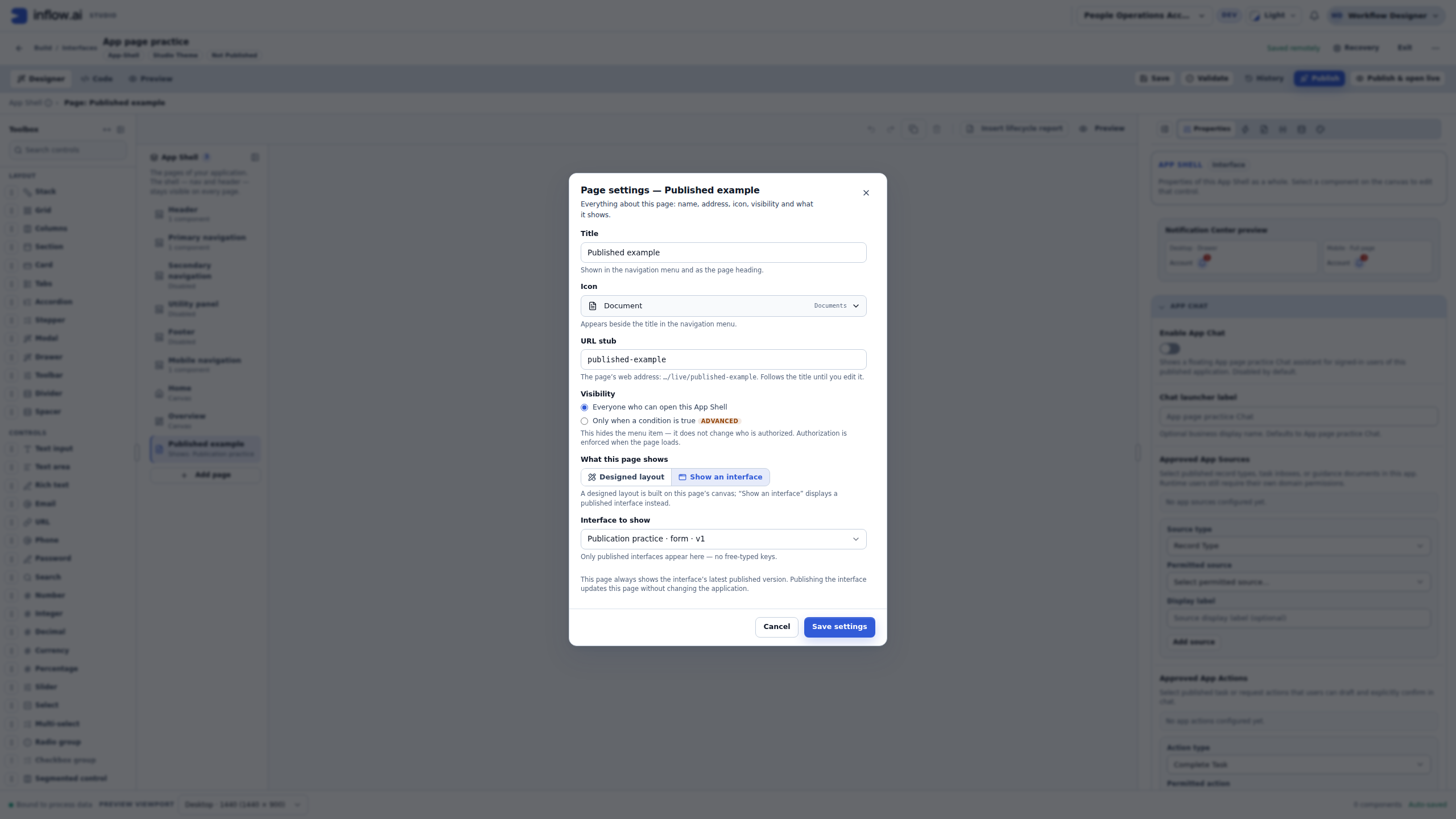
This page already uses the Document icon. The capture is an inspection of an existing synthetic saved draft. It does not show a newly chosen icon being saved or a released application being changed. If you intended to change a Section's title icon instead, cancel this dialog and select the Section in that form's Designer; the page and Section are separate objects.
Search in business language
- Open the current icon choice. The Business icons list contains the available choices, with their names and categories.
- In Search icons, enter
document. - Read the matching names and categories. Similar pictures can have different business meanings; do not pick solely from the shape or color.
- Compare the result with the page title. A generic Document cue is reasonable for a page showing a published form, while an Approved cue could misleadingly suggest a completed decision.
- For this inspection exercise, leave the current choice unchanged. Searching changes the visible options; it does not itself choose a replacement or save the page.
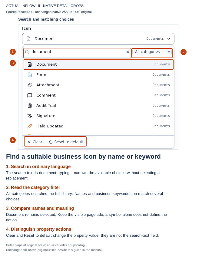
Open the unchanged native original.
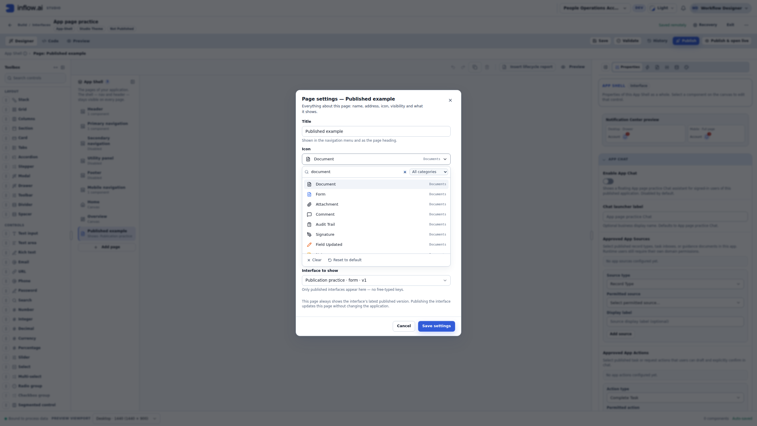
The words you search are not an image URL or a new icon definition. A catalog name such as Document is a human-readable choice. The stable identifier used internally is a separate detail. You do not need to copy a component name from a developer's source code or paste an arbitrary address into this picker.
Use the category filter and recover an empty search
The search text and category filter work together. If you search for a document while a different category is selected, a suitable icon may disappear from the results even though the library contains it. An empty list is not evidence that the application lost the saved icon or that you lack permission to use the page.
- Read Filter by category before deciding that a choice is missing.
- Use All categories when you want to search the full library, or choose the relevant category deliberately.
- If the list says No icons found. Try another keyword., clear the search text and recheck the filter.
- Search again using a shorter ordinary term. For example, try
documentinstead of a sentence describing the whole page. - Close the list when the intended choice is already selected. In this practice, cancel Page settings to leave the saved definition unchanged.
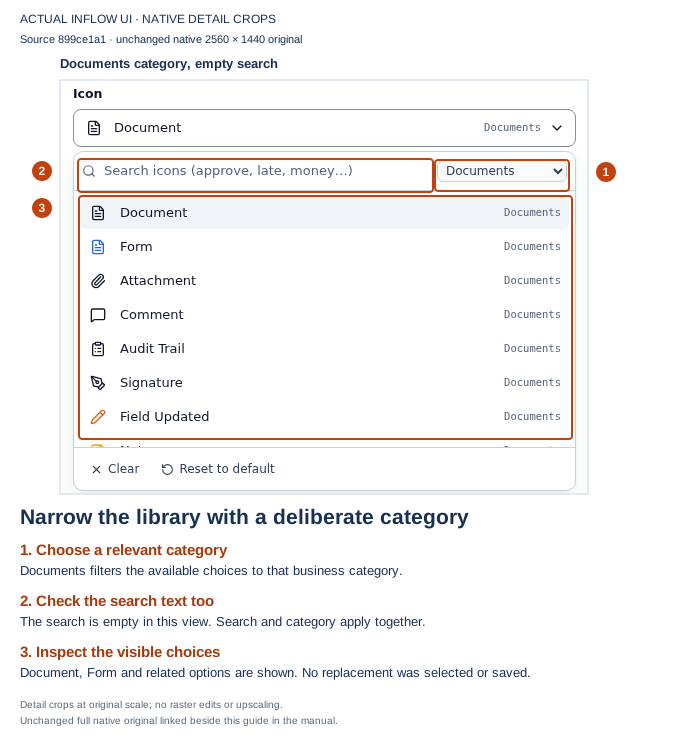
Open the unchanged native original.
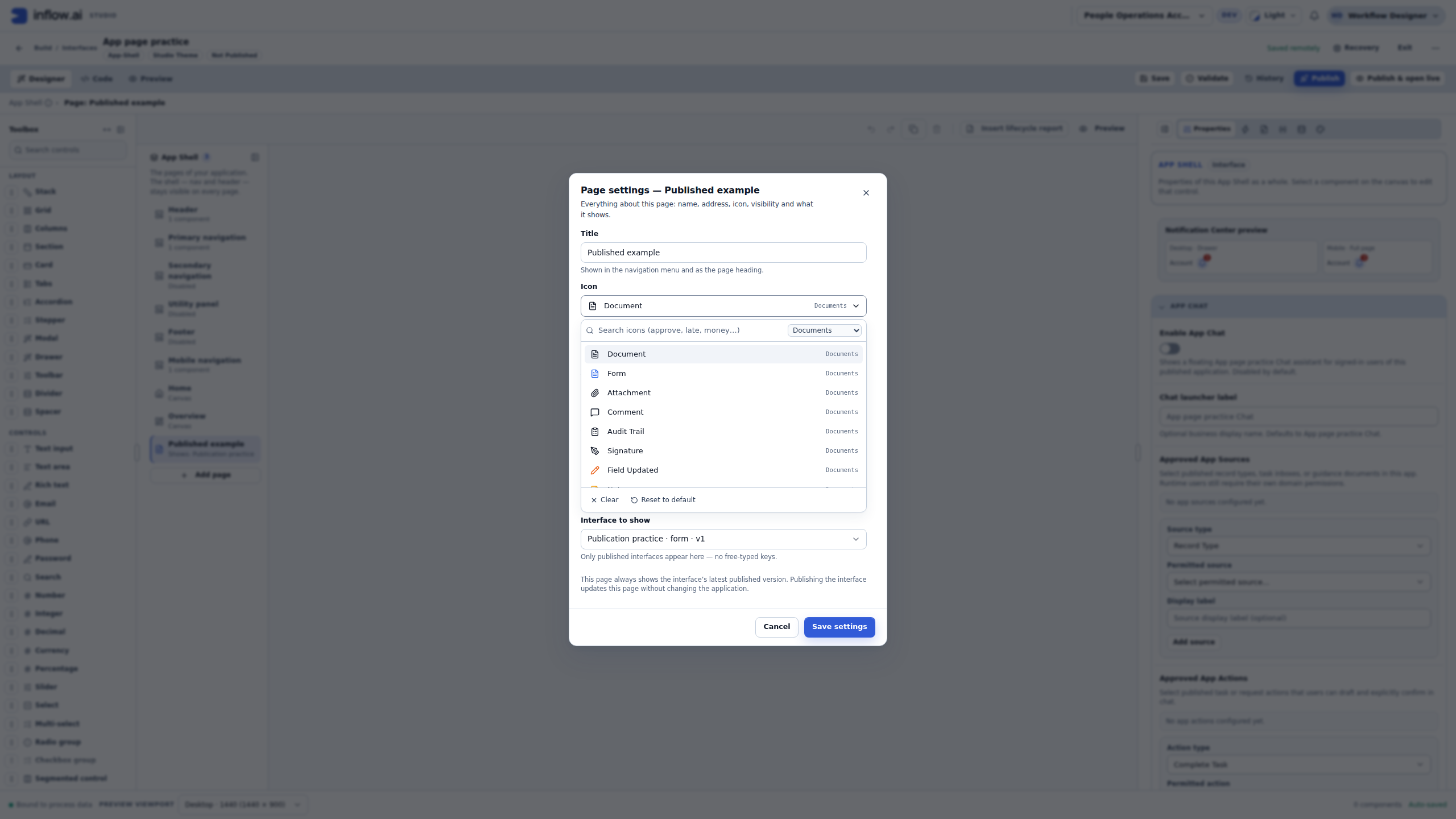
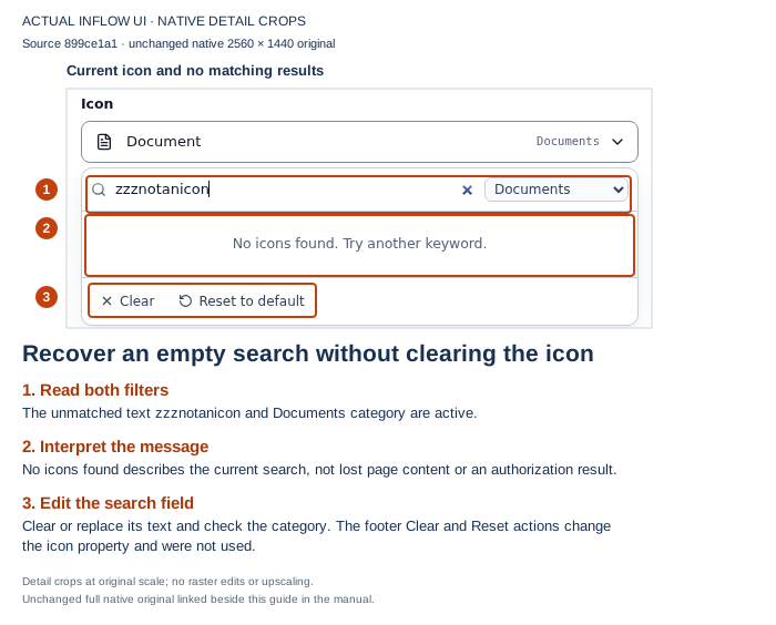
Open the unchanged native original.
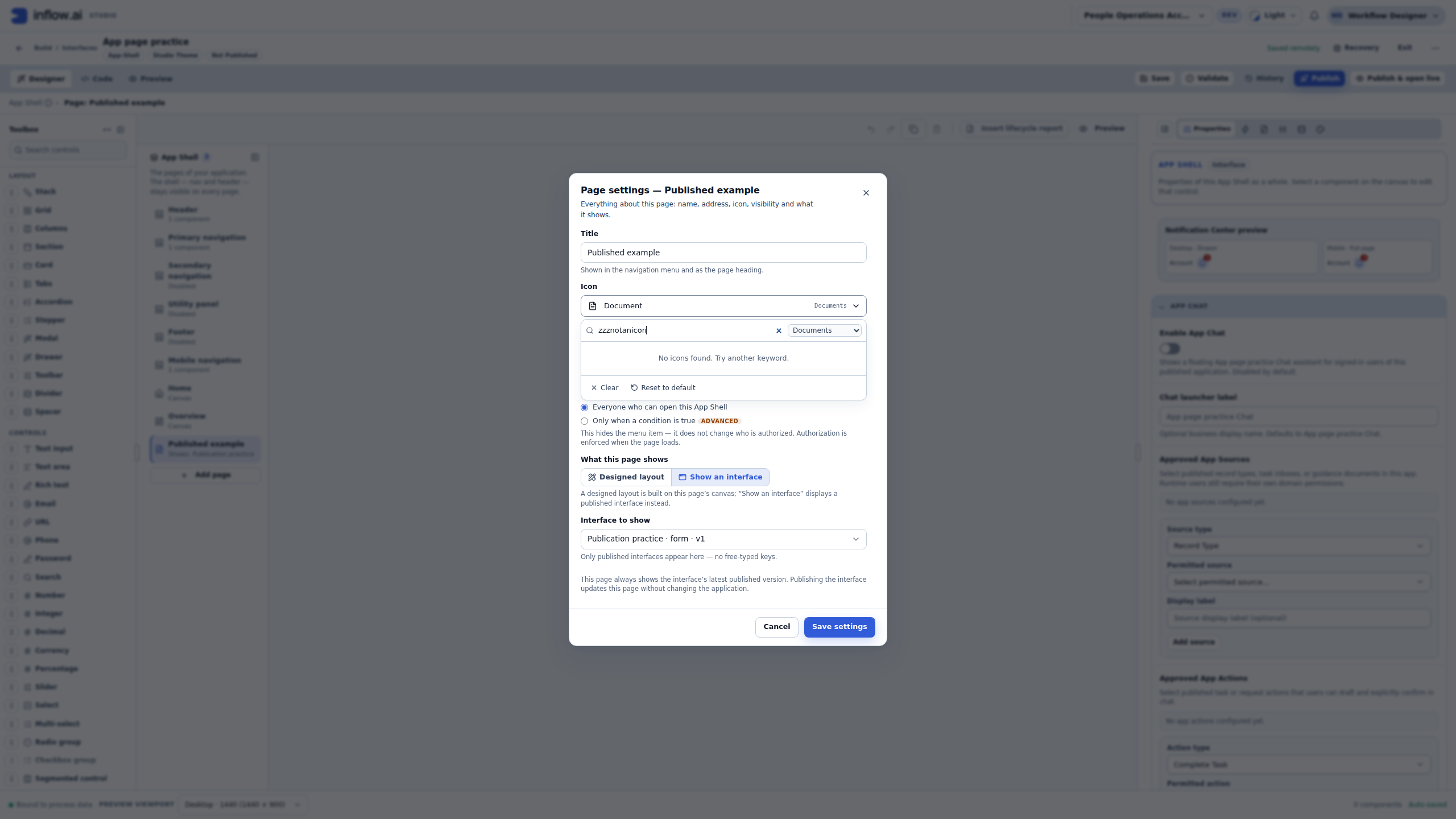
An empty picker result does not authorize installing an extension, fetching a remote picture, changing the user's permissions or editing the screen document by hand. Ask the application owner for an approved visual choice if the available library does not express the idea clearly. Clear words beside a simple icon are usually more useful than an unfamiliar symbol.
Understand selection, reset and clear before committing
Choosing a result is different from typing a search. A selected result changes that property's pending value. Reset to default, where offered, restores the control's supplied default. Clear selected icon clears the selected value, but the surrounding property may supply its own fallback. In particular, Page settings displays a default Document choice when its icon value is empty. Do not promise that clearing every kind of icon property will remove every visible symbol.
The screenshots in this practice show the available picker controls; they do not demonstrate selecting a new value, resetting or clearing a saved page. To make an intended real change, agree on its meaning, select it in the correct property, review the staged result and use the normal save process. Wait for the saved state before leaving. A page-settings change and a confirmed server draft are different stages; the released application still follows its normal review and publication process.
If you are inspecting, choose Cancel instead. Do not save a different page title, target or visibility choice merely to close the dialog. If a save response is uncertain, preserve the message and check the same definition before repeating the action; changing an icon is not a reason to create another app or publish again blindly.
Keep navigation icons separate from status icons
| Where the icon appears | What the icon communicates | What still decides the behavior |
|---|---|---|
| A page menu entry | A cue beside the page's visible name | The page configuration and the signed-in person's ordinary access |
| A Section title | A cue for that group of questions | The Section's contents, form configuration and data permissions |
| A status column | A visual representation of the row's current value | The stored status and the configured business workflow |
| A clickable action | A cue accompanying the action's accessible name | The supported action, confirmation and server authorization |
For example, a page called Published example does not become an approval inbox because its icon resembles a check mark. Similarly, an Approved symbol beside a row is not proof that a manager approved it. Keep visible words such as Pending, Approved and Rejected, and inspect the actual task or record when you need to establish a business result.
Changing a menu icon does not grant a person access to the bound form. A page visibility condition also does not grant that access. Test the eventual application with the intended ordinary user through the authorized access checks; a designer's Preview is not a substitute for that user's result.
The dynamic icon() examples later in this manual remain separate written guidance. The static picker inspection does not execute those formulas against records, demonstrate a complete three-state mapping or change any approval. Use the actual projected field names, supported result recipe and all expected/unknown values when reviewing a dynamic design.
When a formula is appropriate
Some compatible properties or expressions can use icon() to produce an icon value. For example:
icon("approval-approved")
icon is the function. The quoted text identifies an icon from the available catalogue. This is not an image download address, and the function does not turn arbitrary text or a web URL into a supported icon.
Use this only where the selected property accepts that kind of result. For a simple fixed icon, the picker is usually easier to maintain. For a status that changes with business data, use the supported status/display settings or a compatible expression design, and check every possible state.
Keep the status words visible. People may not distinguish colors, and a screenshot of an approved symbol is not proof that an actual task was approved.
Example — Show the icon for a three-state approval status
Suppose Nadia's leave-request table has a Status field whose allowed values are exactly Pending, Approved, and Rejected. She adds a DataGrid expression column to show a matching symbol. The formula reads the current row's item.status value; it only changes how that row is displayed.
=if(item.status == "Approved", icon("status-approved"), if(item.status == "Rejected", icon("status-rejected"), if(item.status == "Pending", icon("status-pending"), null)))
- Confirm the Status field's allowed values are exactly the three named above. This formula explicitly matches each one; any blank, misspelled, or newly added value returns no icon instead of appearing Pending. An unmapped nonblank value remains readable in the adjacent text column. A blank value leaves both cells empty, so ask the data owner what it means and decide whether to correct it or show an explicit missing-value label.
- Make sure Status is available in the grid's projected fields (as a visible or dependency-only field), then add or select an expression column. Choose the Text result recipe for this expression; do not choose the separate Icon tracking-map recipe. Enter the formula using the exact field and value spellings from your application.
- Preview rows for all three values.
Approvedshould show Approved,Rejectedshould show Rejected, andPendingshould show Pending. - Keep a separate, adjacent text column bound to Status so the words Pending, Approved, and Rejected remain visible without color. The expression column presents the symbol only. A blank Status remains blank in both columns; do not interpret it as Pending.
- Save and publish through the normal application flow. Verify that any approval decision still happens through the configured workflow and permission checks.
What you should see: each mapped row has its matching status symbol beside the visible status word; an unmapped nonblank value has no symbol but remains readable in the adjacent text column. A blank has no symbol and no visible text until the data is corrected or the application deliberately supplies a missing-value label. The formula does not approve, reject, or change a leave request. If the application later adds a fourth status, update and review the mapping before publishing.
Check the whole result
After choosing icons, inspect:
- The visible label beside each icon.
- The result at the sizes people will actually use.
- Both long and short labels, including the intended language.
- Focus and accessible names for clickable controls.
- Whether a read-only indicator could be mistaken for an action.
A permission-restricted action must remain absent for a person who cannot use it. Do not replace that policy with an icon that looks disabled but still sends a request.
Common mistakes
- A symbol is hard to understand: use a clearer catalogue choice and keep explanatory words.
- An icon name in a formula is unknown: search the actual catalogue and use its real choice. Do not invent a similar-looking spelling.
- A number or blank value is supplied:
icon()needs the supported non-empty text identifier; correct the input rather than hiding the failure. - The property rejects the value: check whether that property supports an icon value or only a fixed picker choice.
- The icon exists in one environment but not another: ask the administrator to check the available function/icon resources. Do not add an unreviewed remote image as a workaround.
Continue
Read simple formulas if you need a dynamic design, or return to the control guide. Developers can use the optional icon function reference.