Choose and configure the right control
A control is a piece of a screen: a question, a list, a heading or a button. A layout arranges controls so people can understand them. Choose by the person's job before adjusting colors or adding more features.
This guide uses a fictional Leave request form. Nadia builds it, Mohammad enters a request and Sara reviews the resulting task.
Before you start
Create or open a Form in Build → Forms. Have its intended answer fields available in Inputs, or use the record-based form prepared by the data lesson. An answer field tells the form what kind of value it expects; the control tells the person how to enter it.
Walk through a small date-and-reason form
Nadia wants people to understand three questions without an explanation: Start date, End date, and Reason for leave. She first builds a small Control selection practice form in a training workspace. Its answers stay in the interactive test; there is no Submit action in this exercise. The saved form definition can be reopened without turning a practice answer into a leave request.
The pictures follow that actual exercise. They show the normal Workflow Designer account in People Operations Access Practice, where that account can create and edit the form. Your workspace name, functions and available controls may differ. Use the workspace and placement your application owner intended; a control picture is not a reason to change anyone's access.
Each numbered picture contains labeled detail crops from one unchanged screenshot. Read its numbered explanation, then open the full-size guide or original when you need more context. Keep the distinction between the form's definition and the answers entered while testing it: Save stores the definition; the interactive test holds its current answers.
1. Create a separate practice form
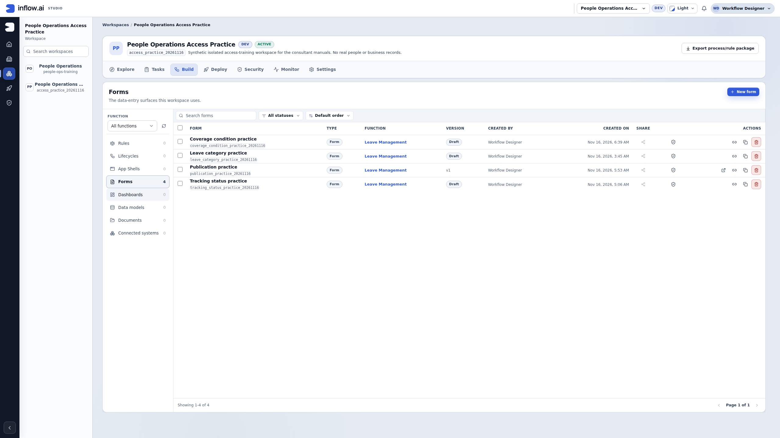
- Open the intended workspace, select Build, and choose Forms in Workspace resources. Check the workspace title before creating anything. The recorded workspace already contains four unrelated practice forms; those remain separate.
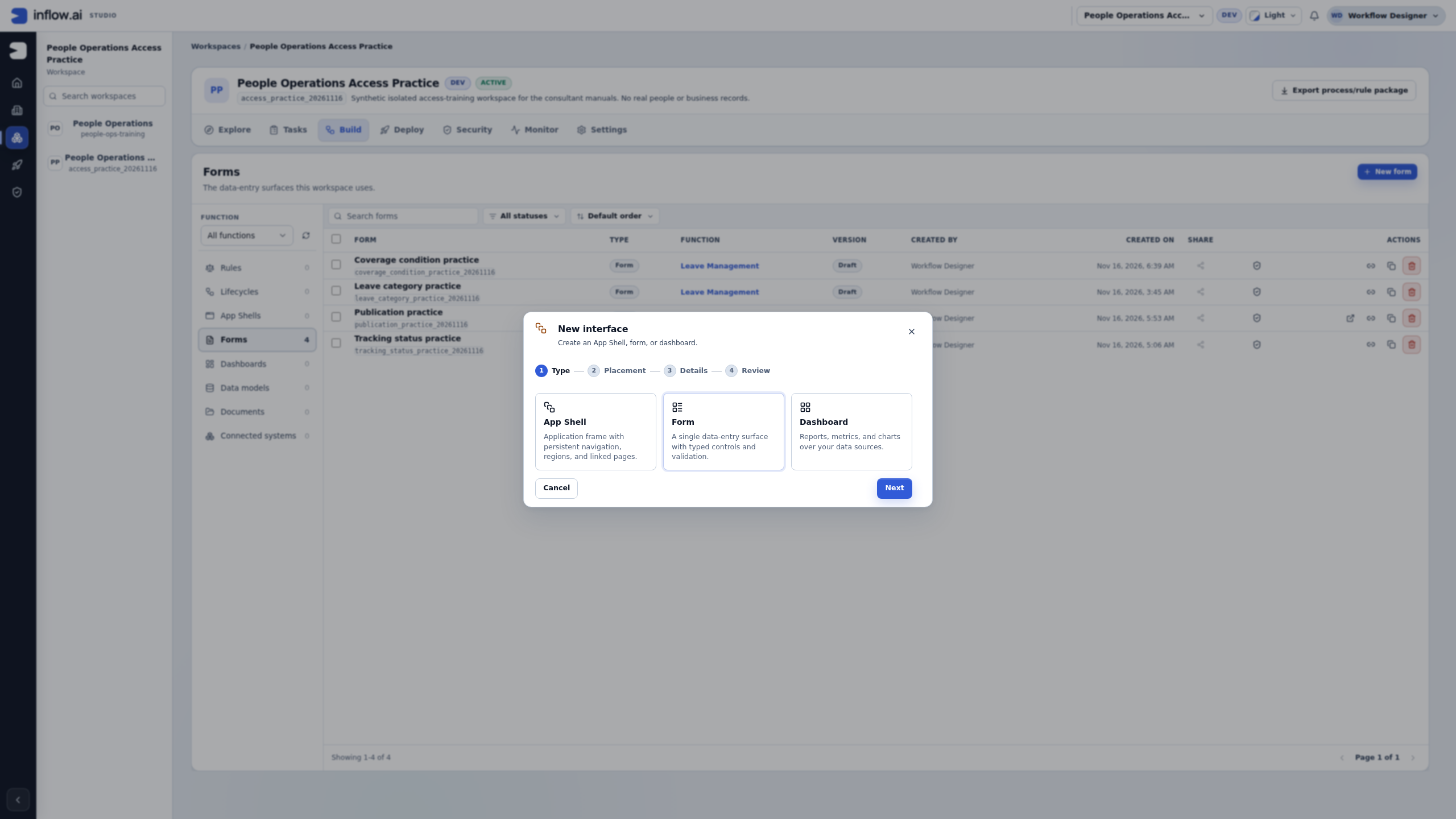
- Choose New form. The interface wizard opens with Form selected in its Type step. Keep Form for this single data-entry surface. An App Shell supplies an application frame and navigation; a Dashboard serves reporting.
- Choose Next. In Placement, select the intended business function. The example uses Leave Management. Workspace-level placement is also offered, but use the placement agreed for your own form.
- Continue to Details. Set Title to Control selection practice and choose an available Key. The recorded key is
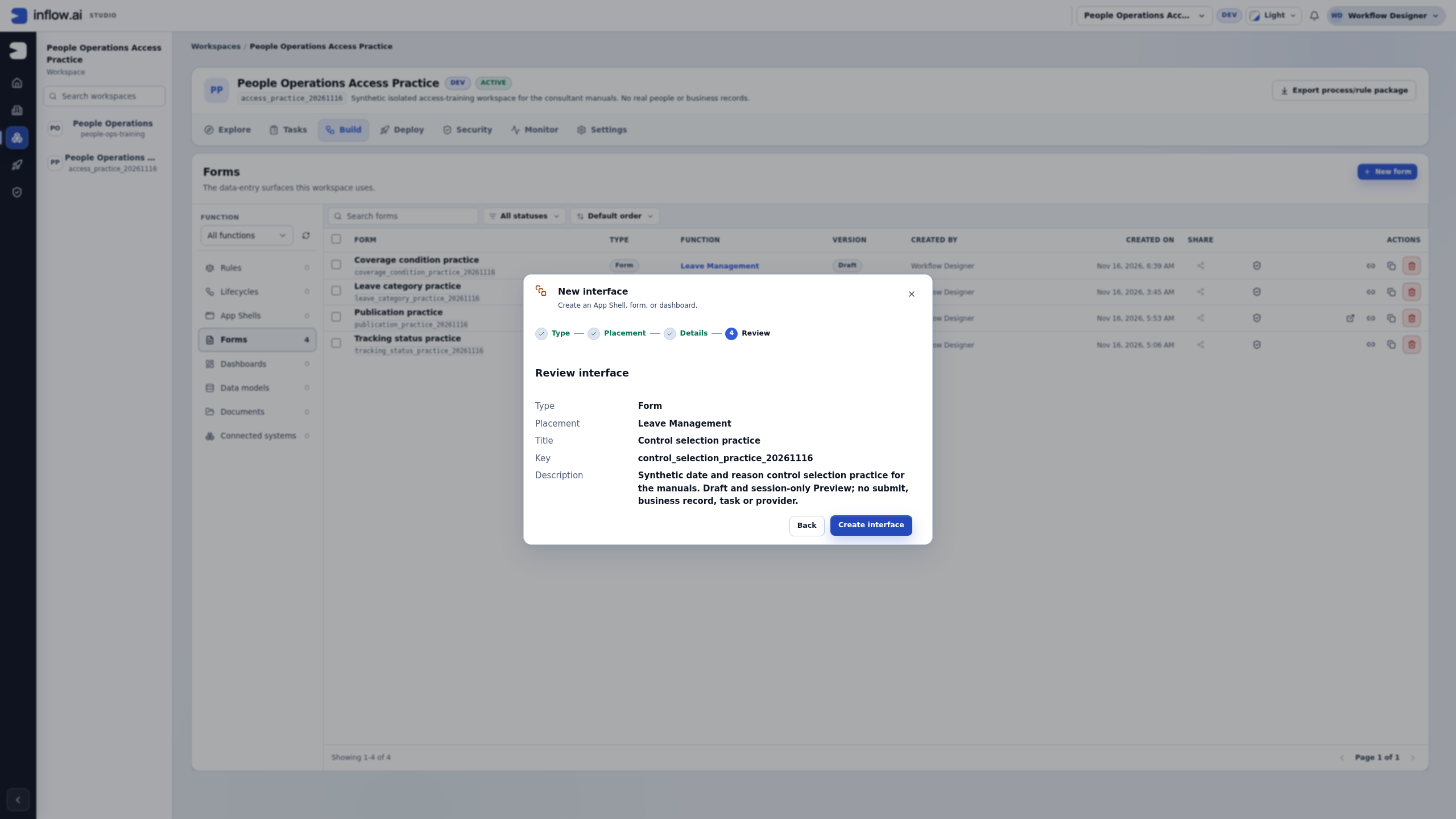
control_selection_practice_20261116; if it is already in use, keep the existing definition intact and choose a new key for your own exercise. Describe the form as a synthetic draft and session-only Preview exercise. - Continue to Review. Read the type, placement, title, key and description together. Use Back if one is wrong. Choose Create interface once when the review is correct, then wait for Designer to open the created draft.
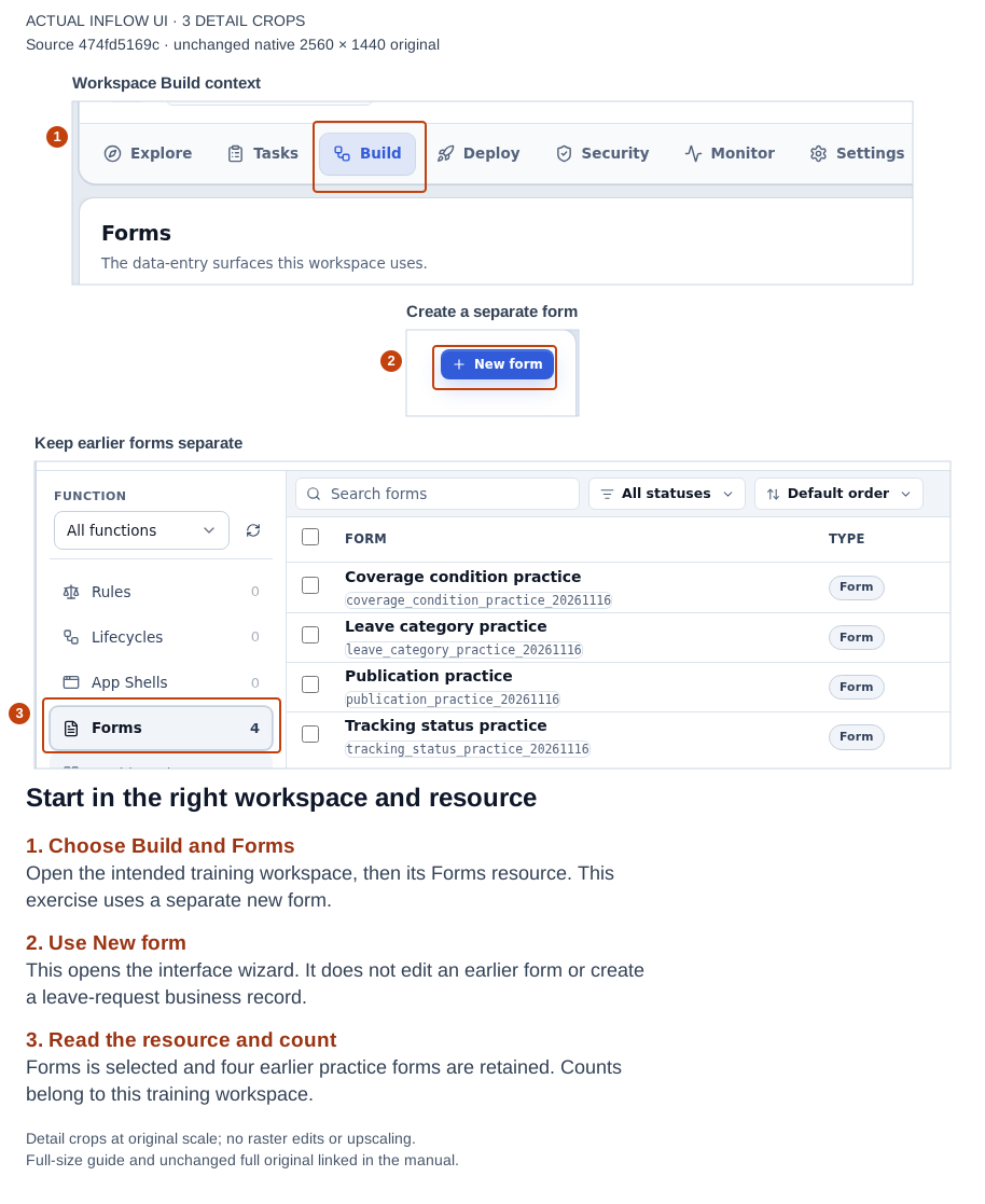
The entry point is the selected workspace’s Forms resource. The earlier practice forms remain in the catalog. Open the full-size numbered guide; open the unchanged original screenshot.
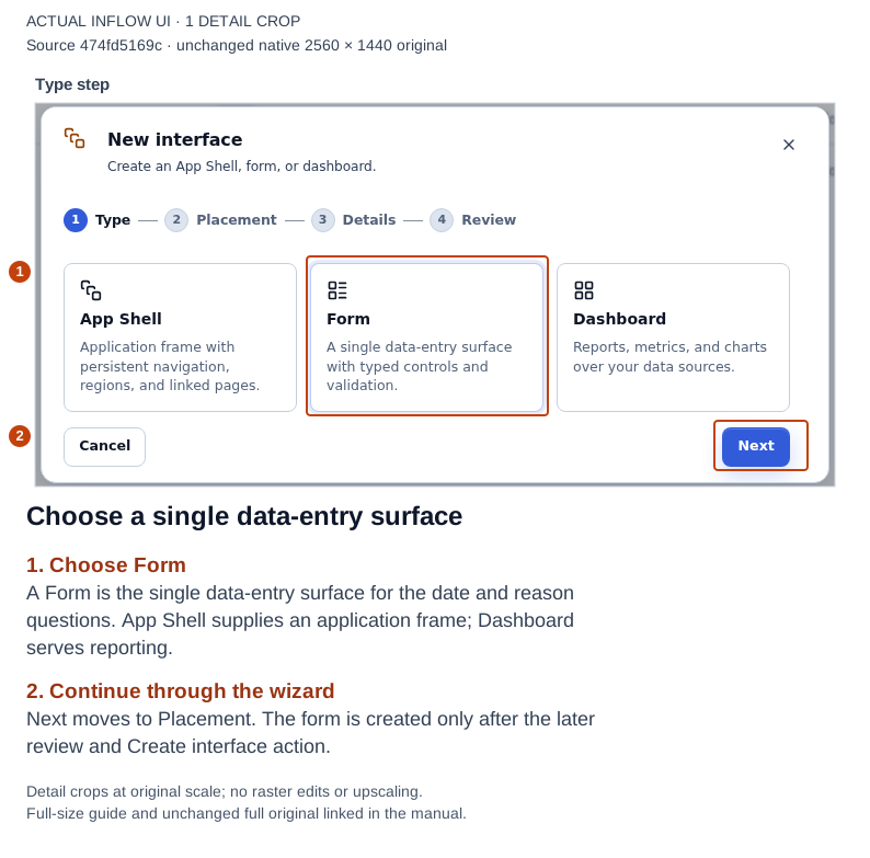
Choose the surface that matches the job: this exercise needs one Form. Open the full-size numbered guide; open the unchanged original screenshot.
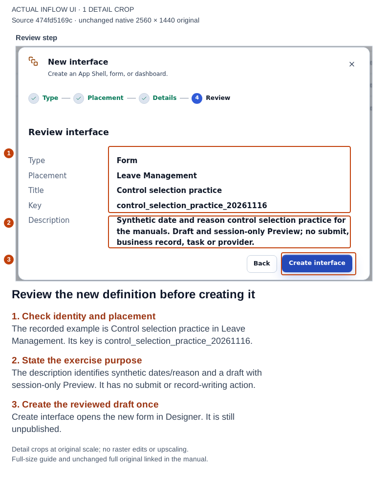
Review the new definition before creating it. This review creates an unpublished form definition, not an employee request. Open the full-size numbered guide; open the unchanged original screenshot.
2. Give each question a typed answer destination
A question's label is what the person reads. Its answer destination is where this form puts the value. Declare those destinations before connecting the controls.
- In Designer, open Inputs in the right panel. Choose Add input.
- Set its Type to Date, enter Name
startDate, and leave the name field to commit it. Keep Single and a blank Default. - Add another Date input named
endDate. Keep it Single with a blank Default. It is a separate destination even though it has the same type asstartDate. - Add a Text input named
reason, also Single with a blank Default. - For this exercise, leave the input declarations' Required switches off. The questions will be required through their own Validation settings, allowing the interactive test to start empty and demonstrate the missing-answer messages.
- Choose Save and wait for Saved remotely. Recheck all three names and types before adding the questions.
| Declared input | Type | Intended question | Practice default |
|---|---|---|---|
startDate |
Date, Single | Start date | Blank |
endDate |
Date, Single | End date | Blank |
reason |
Text, Single | Reason for leave | Blank |
The declaration's Required switch belongs to the form's incoming-value contract. A question's Required setting decides whether that visible answer is needed in this form check. Agree both contracts with the application owner when the form becomes part of a real application; the exercise deliberately keeps them separate.
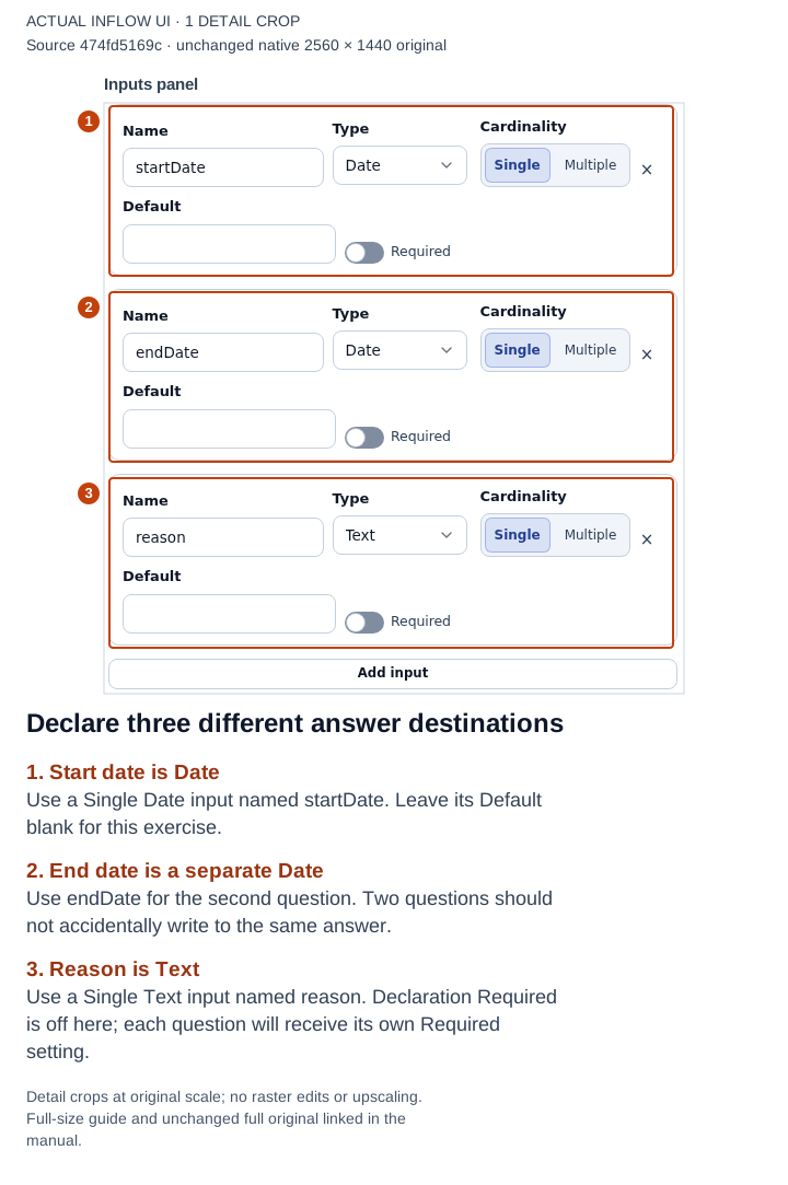
Separate answer names prevent the two date questions from overwriting the same destination. Open the full-size numbered guide; open the unchanged original screenshot.
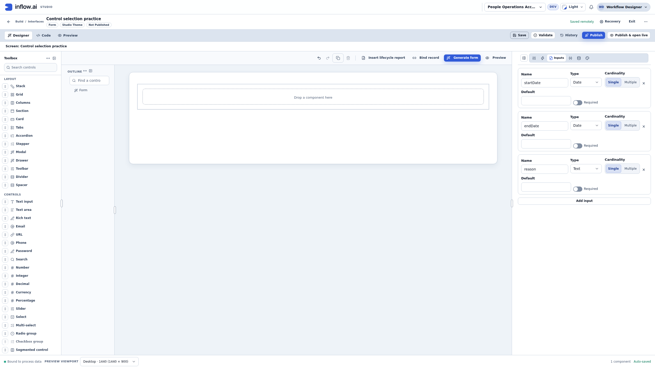
3. Add a section and the Start date question
- Select Form in Outline so the insertion point is clear. Add Section from the Toolbox, then open Properties for that Section.
- Give the Section a useful internal Name, such as
leaveDetailsSection, and set Title to Leave details. Use Description for a short instruction: Choose dates and explain this practice request. - With the Section selected, search the Toolbox for Date. Read the offered controls: Date, Date and time, and Date range are different choices. Add Date for the single Start date question.
- In its Properties, set Name to
startDateQuestionand Label to Start date. A friendly Label does not connect the answer by itself. - Explicitly select Display format → yyyy-mm-dd for this exercise. Keep Calendar → Gregorian. The sample date
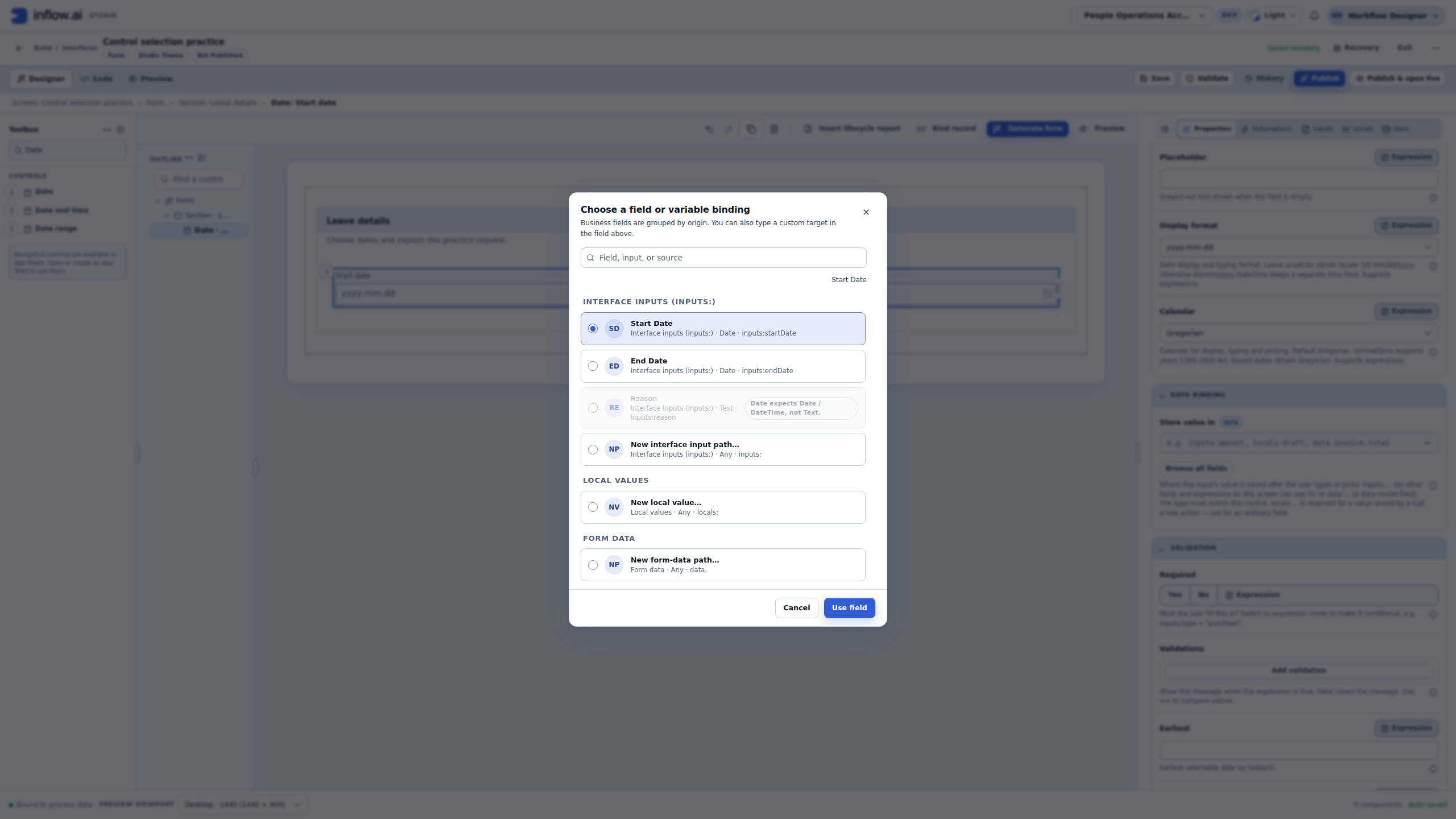
2026-12-07then has a clear year-month-day presentation. Leave Computed value and Default value empty so they do not supply the practice answer for you. - Under Data Binding → Store value in, choose Browse all fields. In Choose a field or variable binding, select Start Date. Check the displayed Date type and
inputs:startDatedestination, then choose Use field. - Read the incompatible choices as guidance. In this picker, Reason is Text and unavailable for a Date question. Keep its intended type and choose the existing compatible Date answer; do not create a lookalike path just to bypass the mismatch.
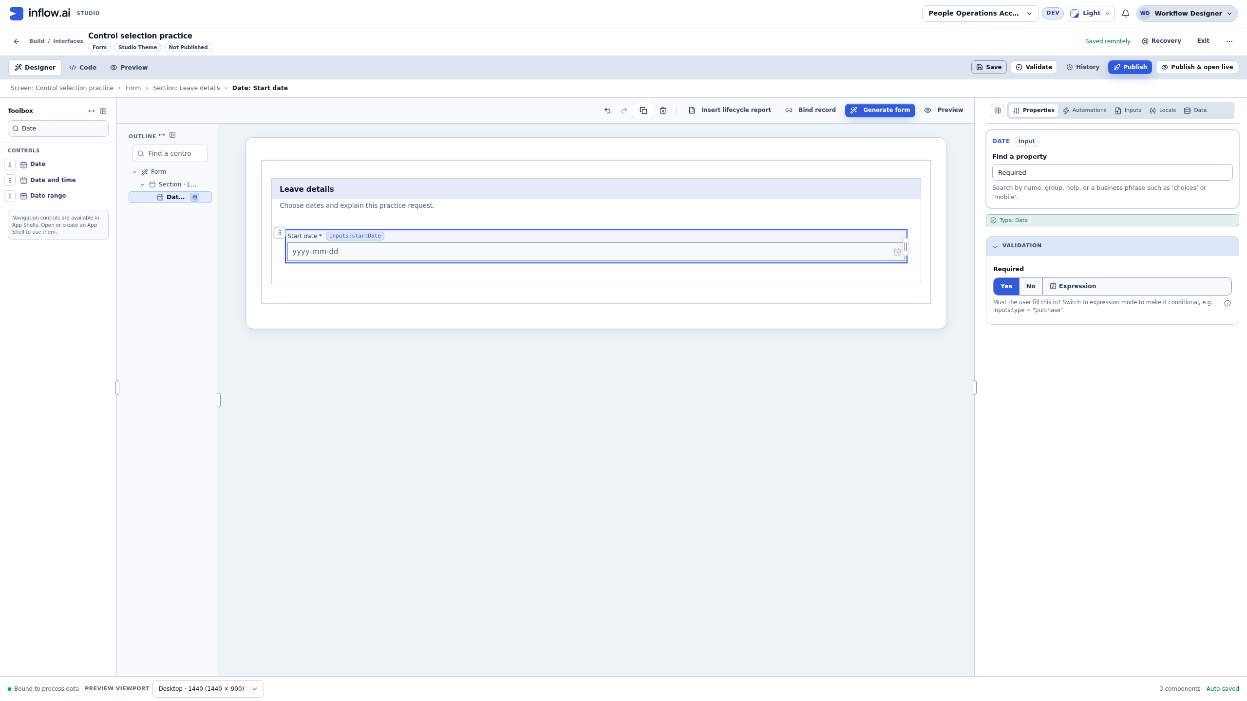
- In Find a property, search for Required, then set that question's Required to Yes. The canvas shows an asterisk beside Start date. This is the question's Validation setting, not the input declaration switch.
- Choose Save. Check the selected-component path and the canvas binding chip before continuing: the question belongs under Form → Section: Leave details, and its destination is
inputs:startDate.
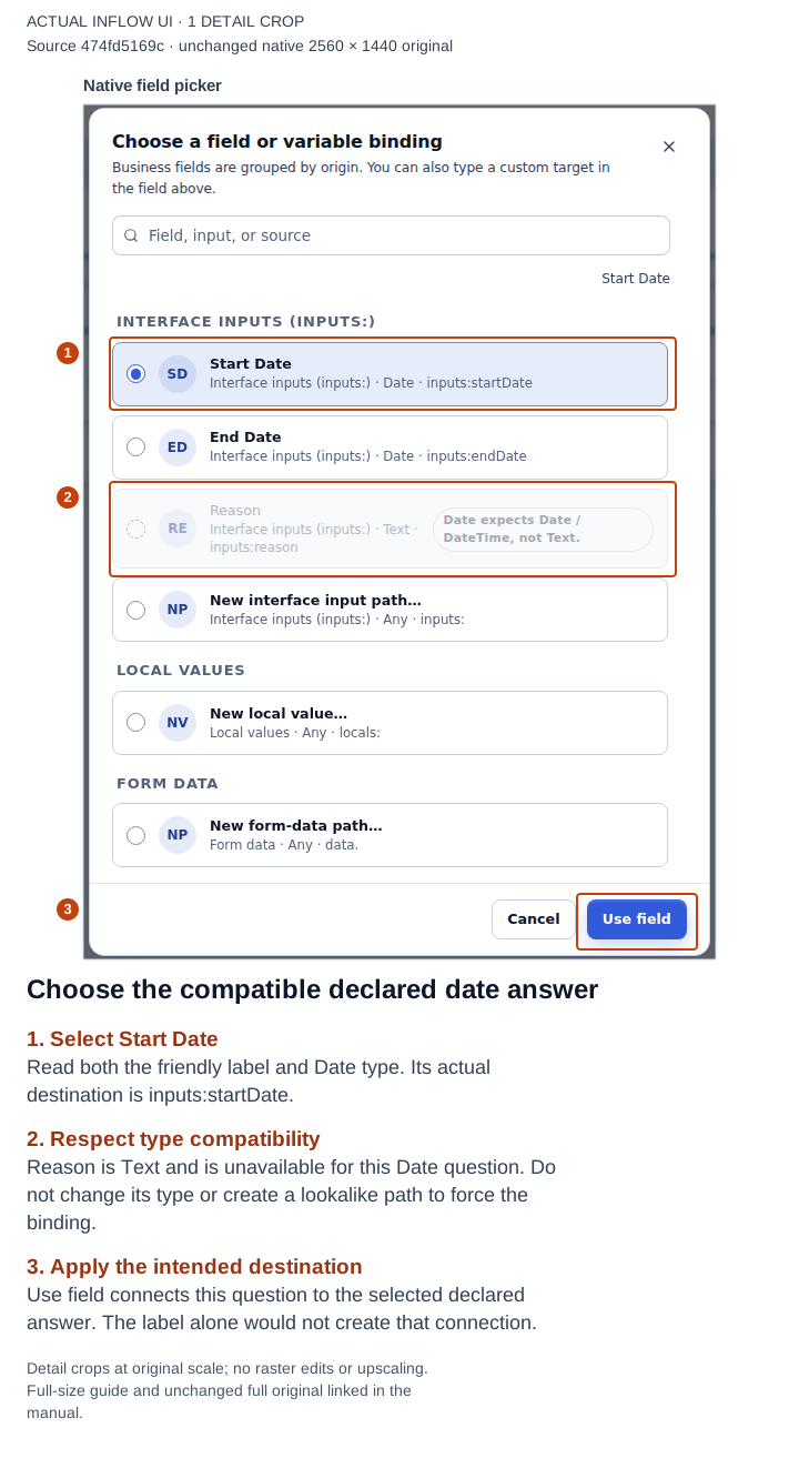
Read the destination and type together, then use the offered field. The disabled Reason choice reflects a type mismatch in this exercise. Open the full-size numbered guide; open the unchanged original screenshot.
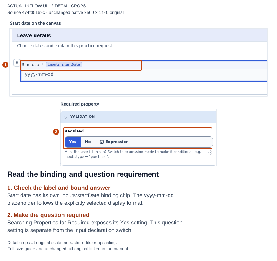
The binding, explicit date placeholder and question requirement have different jobs. Check each deliberately. Open the full-size numbered guide; open the unchanged original screenshot.
4. Add End date and a longer reason question
- Select Section: Leave details in the selected-component path before inserting the next question. This keeps the related controls in the same Section.
- Add a second Date control. Give it Name
endDateQuestionand Label End date. Explicitly choose yyyy-mm-dd again and keep Gregorian. - Use Store value in → Browse all fields, select the existing End Date input, and choose Use field. Confirm
inputs:endDate; do not reuse the Start Date destination. Set this question's Required to Yes. - Select Section: Leave details again. Search the Toolbox for Text area, and add it for the longer explanation. In Properties this control is identified as TextArea.
- Set Name to
reasonQuestion, Label to Reason for leave, and Placeholder to For practice, enter Annual leave. A placeholder is a hint while the answer is empty; it does not fill the answer. - Use its Store value in picker to choose Reason, the declared Text input, and apply the field. Set the question's Required to Yes.
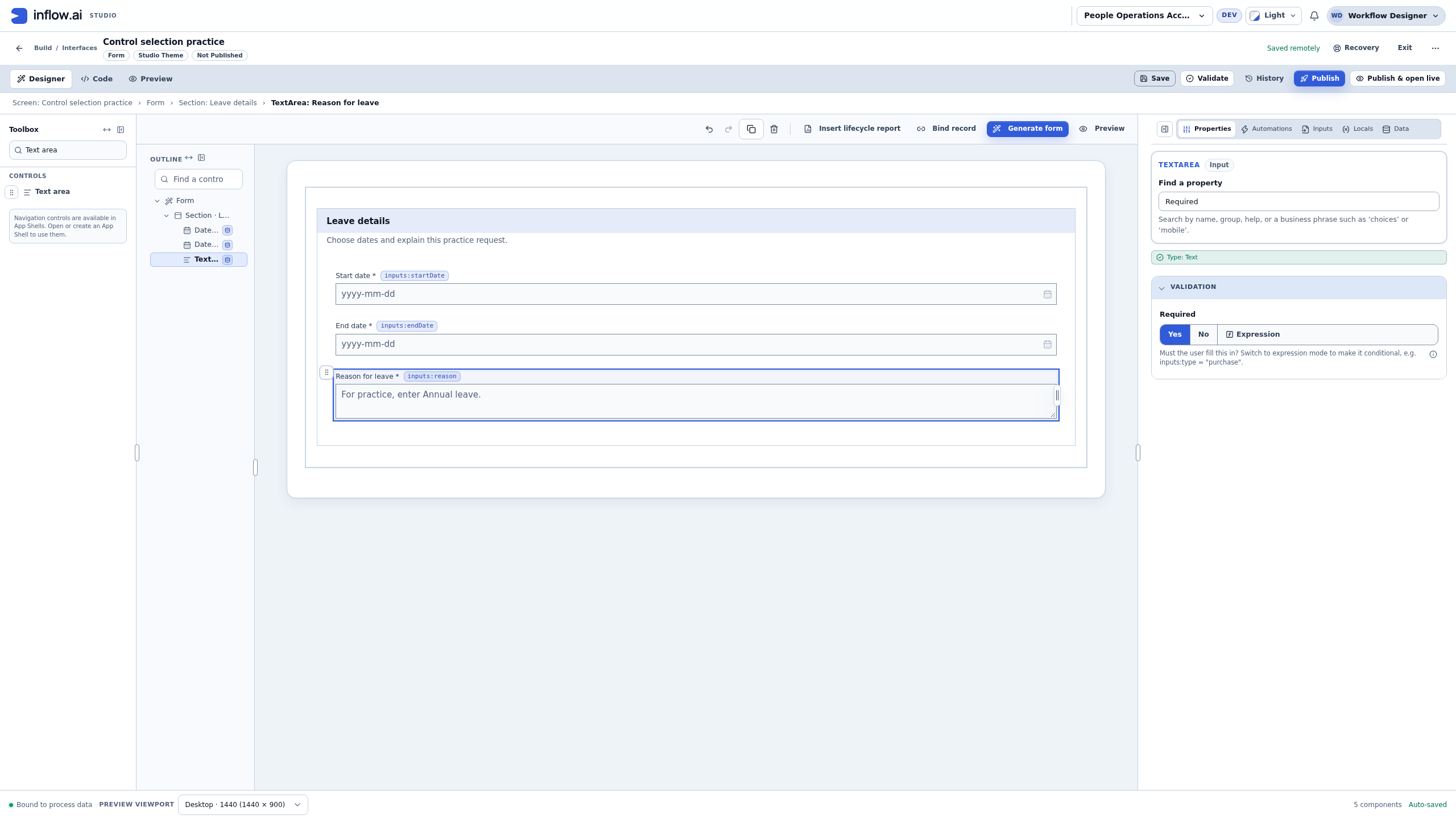
- Save the form. Inspect Outline and the canvas: one Form contains one Leave details Section with two Date questions and one TextArea. All three labels have asterisks and separate binding chips. The top of the recorded draft still says Not Published.
This simple stacked layout is enough to test the questions. If your own design needs Columns or a different layout, select the intended parent before inserting or moving controls and inspect the resulting Outline. Keep the labels and error messages understandable before making the layout more elaborate.
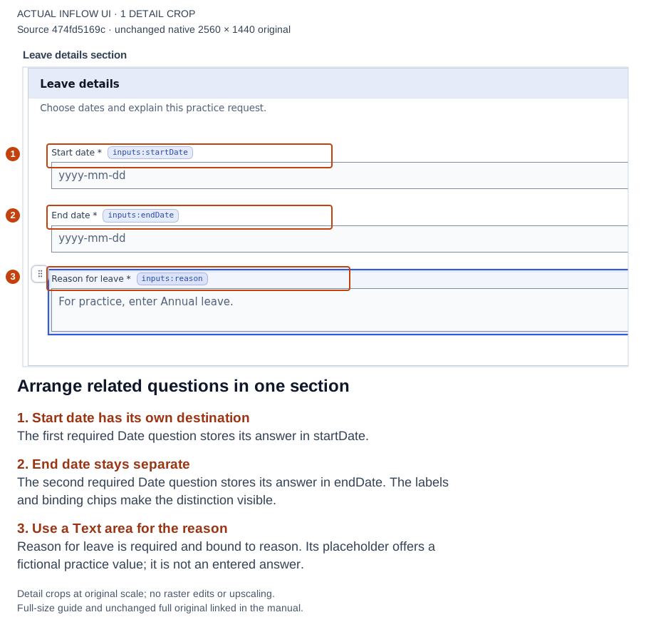
The visible Label and binding chip let you compare what the person reads with where the answer goes. Open the full-size numbered guide; open the unchanged original screenshot.
5. Find and repair a missing answer
- Open the top Preview tab and keep Interactive selected. Read Test mode · your entries stay in this session before entering the fictional values.
- Enter
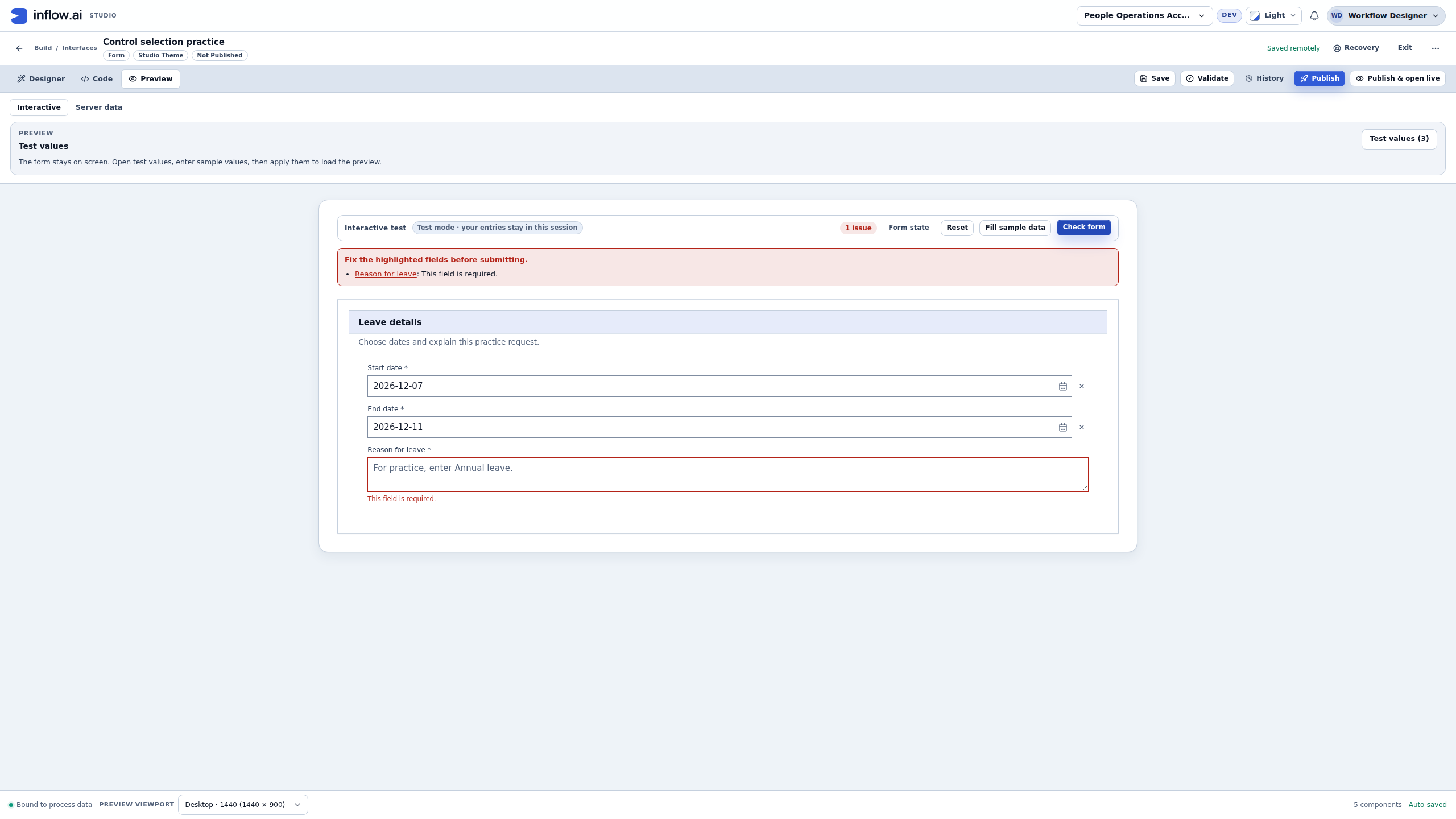
2026-12-07in Start date and2026-12-11in End date, using the explicitly selected yyyy-mm-dd format. Leave Reason for leave empty. - Choose Check form. The recorded result is 1 issue: Reason for leave: This field is required. Both date answers remain visible. The reason's placeholder is still a hint, so it does not satisfy Required.
- Choose Reason for leave in the linked issue summary. It focuses the actual text area. Use the summary to reach the problem rather than searching for a different question with a similar name.
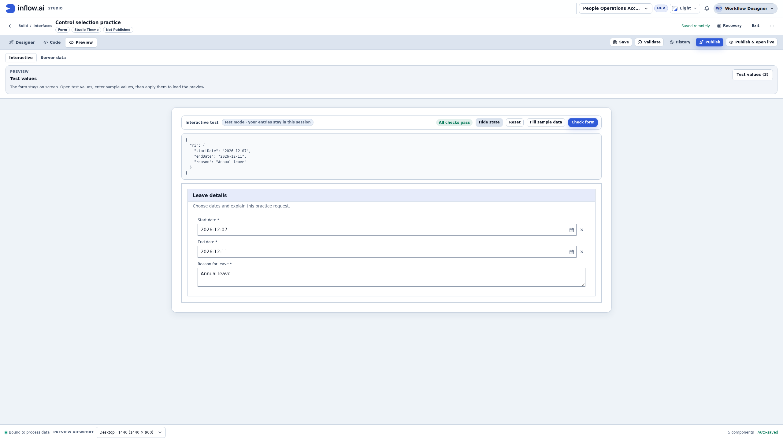
- Enter Annual leave in the reason and choose Check form again. The issue disappears and the result is All checks pass.
- If you need to confirm the destinations, open Form state. In this exercise it shows separate
startDate,endDateandreasonvalues inside the displayedriobject. This state view does not mean you should rename the declared Inputs or type an unfamiliar binding into Properties.
The generic issue summary says to fix highlighted fields before submitting. In this particular exercise, Check form only checks the local test answers; the draft has no Submit action. All checks pass means these configured checks passed. It does not calculate leave entitlement, working days, policy eligibility, record permissions or an approval.
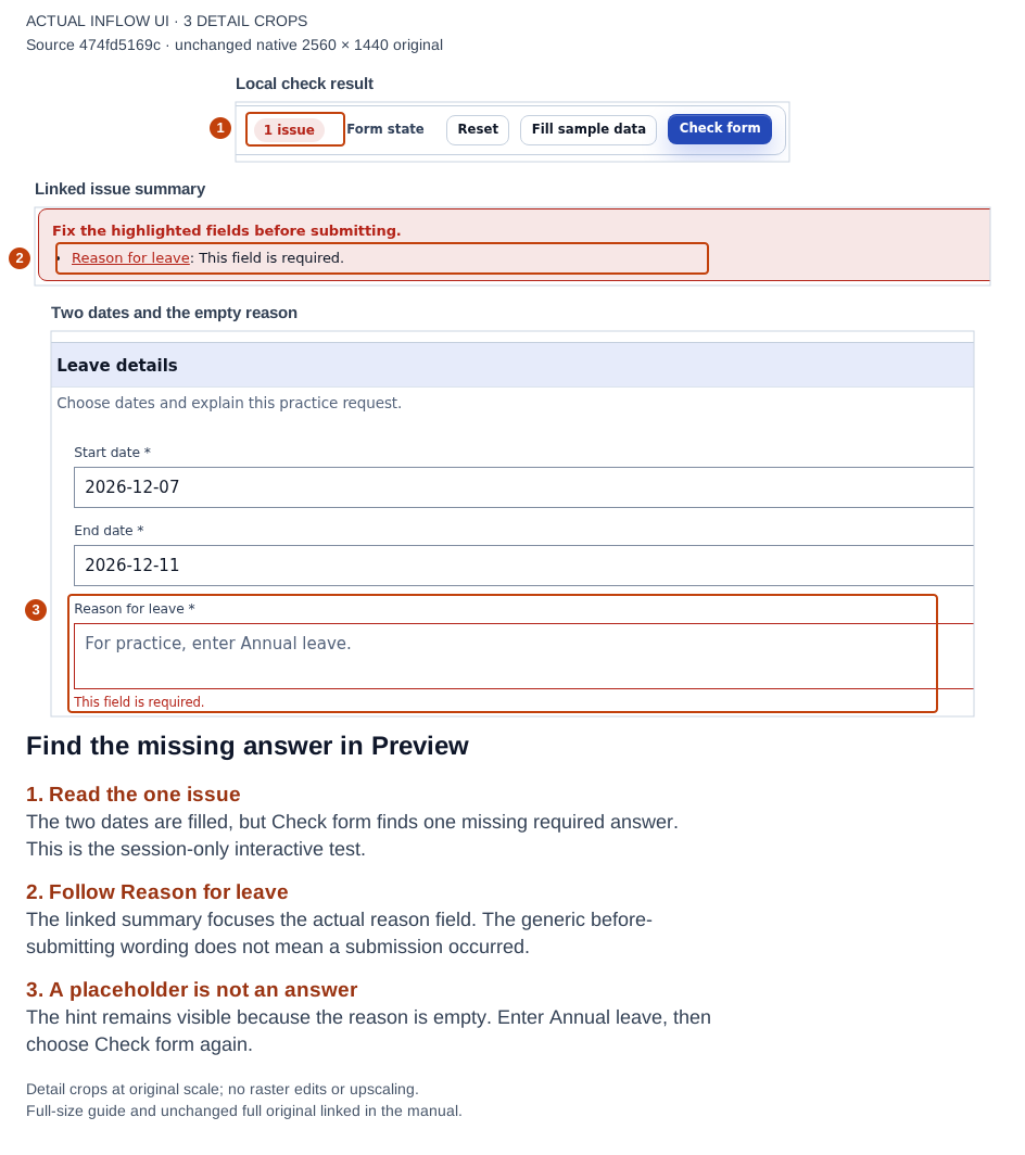
The empty reason is the one missing answer. Follow its summary link, enter the reason and check again. Open the full-size numbered guide; open the unchanged original screenshot.
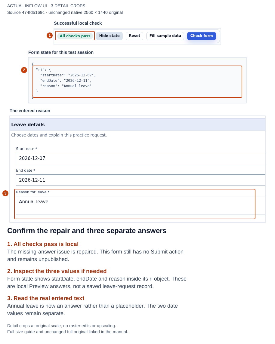
The reason is now entered text. The state display helps Nadia confirm the bindings before connecting a real application workflow. Open the full-size numbered guide; open the unchanged original screenshot.
6. Reset, reopen and inspect a narrower frame
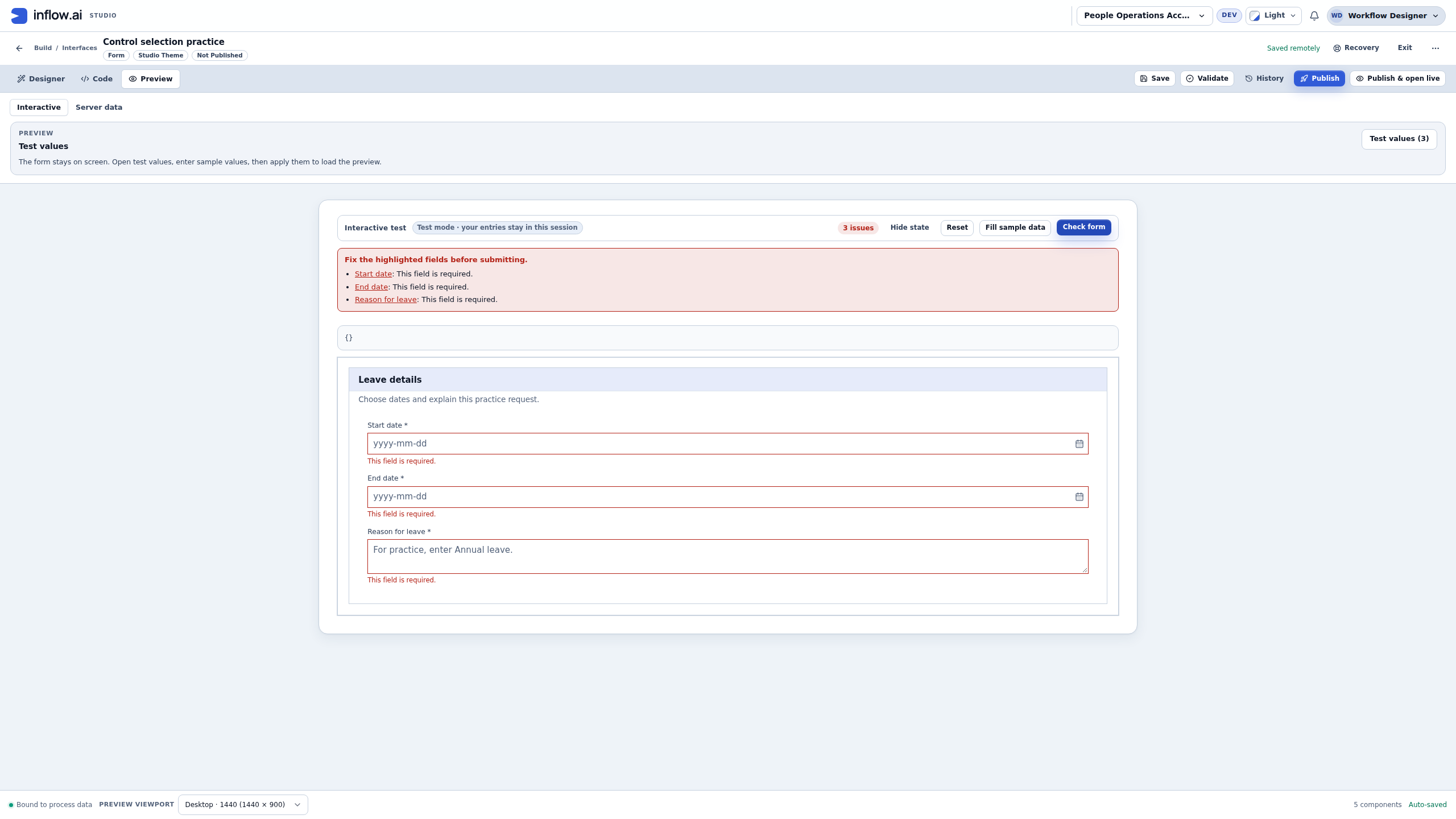
- In the same interactive test, choose Reset, then Check form. In the recorded exercise, all three direct Preview entries become empty and the result is 3 issues. An open Form state display is empty. The three saved questions still exist.
- Reopen or reload the saved draft and return to Preview. Check it with no answers: Start date, End date and Reason for leave are still required. The recorded reload keeps the saved definition and starts without those earlier local answers.
- Enter the two fictional dates and Annual leave again, then choose Check form. The recorded result returns to All checks pass.
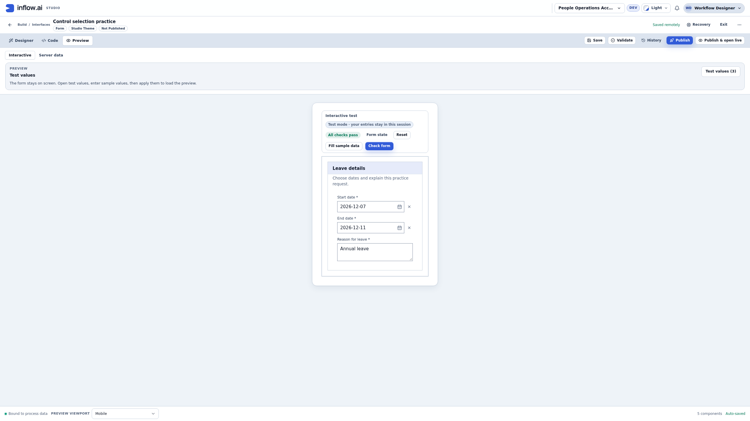
- In the footer's Preview viewport, choose Mobile. Inspect the stacked labels, date values and text area in the narrower built-in frame. Use the frame's actual scrolling when necessary, and inspect validation messages there as well as the filled fields.
- Return to the appropriate desktop Preview setting when continuing your design. The built-in Mobile frame is a useful authoring check; it is separate from testing a published application on the actual devices and browsers your users need.
Reset in this exercise clears its direct test entries. It is not an instruction to clear a real employee request or a business record. Reopening confirms the saved question settings; it does not publish the form. A real application needs a separately configured and authorized submission or workflow path.
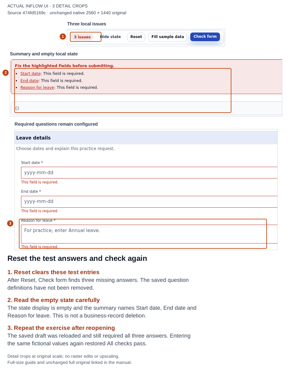
Keep test answers separate from the saved definition. The same required settings were checked again after reopening the saved draft. Open the full-size numbered guide; open the unchanged original screenshot.
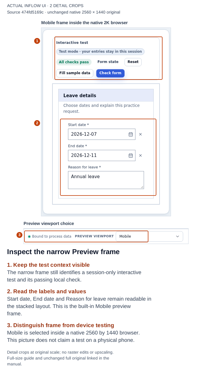
This is the Mobile authoring frame, not a photograph or a physical-phone acceptance test. Open the full-size numbered guide; open the unchanged original screenshot.
Quick checks when the exercise differs
| What you notice | What to inspect next |
|---|---|
| The date input is missing from the picker | Check the declared input's exact name and Date type, then reopen the question's offered destination picker. |
| A similarly named answer is unavailable | Read the type guidance. Keep the intended business type instead of creating a guessed path. |
| Both questions appear to change one answer | Compare their destination chips: Start date uses startDate; End date uses endDate. |
| The displayed date order is unexpected | Explicitly choose the intended Display format and inspect Calendar before re-entering the fictional date. |
| The hint looks filled but Required still fails | A Placeholder is not an answer. Enter real practice text and use Check form again. |
| The wrong question is difficult to find | Select it in Outline or use the linked issue summary; inspect the selected-component path. |
| A saved form reopens with empty test answers | Recheck the saved definition separately from the session's direct Preview entries. |
| The local check passes | Continue with the application's separately configured workflow and permission checks; the exercise has only tested its own questions. |
The remaining examples below apply these control-selection decisions to other situations. Record sources, installed controls and existing tasks need their own configured origins and authorized runtime checks; they are separate from the date-and-reason exercise pictured above.
Example 1: ask for dates and a reason
- In Designer, select the layout section where the questions belong.
- From the Toolbox, add a Date control. Set its label to Start date.
- Under Data Binding, use Store value in to select the declared Start date input. Choose a Date input, not a similarly named Text input.
- Add another Date control for End date, connected to its own answer field.
- Add a TextArea labelled Reason for leave. Connect it to the declared reason input and add helpful wording such as “For this exercise, enter Annual leave.”
- Under Validation, turn on Required for the answers this form really needs.
- Check the questions in Preview with fictional values, including one missing required answer.
The visible labels should make sense without an explanation from Nadia. The date controls should store dates in their separate answer fields. A label reading “Start date” does not by itself connect the answer.
If a field is missing from the destination picker, check the declared Inputs or record form first. Do not type an unfamiliar path copied from another project.
Example 2: offer a short, understandable choice
Suppose the teaching app asks for a leave category: Annual leave or Other.
- Add a Select for one choice, or Radio group when both short choices should stay visible.
- Set Label to Leave category.
- Under Choices, enter the offered choices. Keep the displayed label separate from the stable value used by the application.
- Use Store selection in to choose the compatible answer field.
- Decide whether an answer is required and test an empty choice as well as both valid choices.
A single choice needs a single-value answer. Use Multi-select or Checkbox group only when the application expects a collection of choices. Do not use a group of unrelated Yes/No questions to imitate one controlled category.
Worked example: keep the stored choice separate from its label
For a new teaching Select, Mohammad should choose Annual leave or Other. The label is for people; the stored ID is the answer value used by the app.
- Add a Select and inspect its Choices setting. For this new example, choose Fixed list. If an existing control is already set to Dynamic list, keep its rule-backed source unless the owner has approved changing that behavior; changing modes can replace the option source.
- Inspect the existing rows before editing. Retain any row that already has the intended ID and label, and use Add option only for a missing choice.
- Set Stored id
annualwith Label shownAnnual leave. Add Stored idotherwith Label shownOther. If Mohammad selects the first row, the selected answer isannual, not the wordsAnnual leave. - Under Data Binding, use Store selection in and choose the intended compatible single-value answer. The binding destination is where the selected ID goes; it is not where the option list is defined.
- Correct every blank or duplicate stored ID shown by the editor before using the control. It reports that every option needs a value and that option values must be unique. Do not rename IDs on an established form until the owner checks existing saved answers and downstream rules; those may depend on the ID.
- Preview the two labels, choose each one and inspect the answer value. This checks the form's selection behavior; it does not prove a workflow output mapping or durable business-record write.
Keep the underlying IDs stable while wording changes. For example, the owner may approve changing the displayed label from Annual leave to Vacation days while keeping annual; that preserves the existing answer value. A Dynamic list is different: its choices come from a Call a rule result, so use that mode when the values must be prepared by the rule rather than typed into the control.
Arrange the questions
- Add a Section or Card with a clear title such as Leave details.
- Use Outline to check that the date/reason controls are inside the intended section.
- Use Columns when two related fields should share a row; inspect the small-screen arrangement as well.
- Adjust the offered spacing and width settings. Keep labels and error messages readable before adding decoration.
- Use Undo if you move the wrong field, then select the intended parent in Outline and try again.
A record grid and a Task viewer show their own content. They are not empty layout boxes into which you should insert arbitrary questions.
Example 3: show records rather than ask questions
For My leave requests, use an appropriate list control such as Data grid. Open its supported Connect data editor and choose the prepared source. Select useful fields: request reference, dates, requested days and status. Keep technical or private fields out of the display.
Configure only the interactions the source offers, such as searching, sorting or selecting a row. Inspect a permitted example and the empty/loading experience. An unavailable source is not a trustworthy count of zero. For one selected request's information, consider Record view rather than a second unrelated grid.
Worked example: clear a selected record without deleting it
Suppose Mohammad picked Acme Corporation in the form's Company Lookup, then realizes he chose the wrong company. Clearing changes the form answer. It does not by itself delete Acme Corporation or change the Lookup's permission-filtered source; inspect the control's configured clear and selection-change handlers for any additional actions.
- Confirm with the form owner that clearing this selection is expected. A required answer can be temporarily cleared, but the form may reject submission until Mohammad chooses a replacement.
- In the published form, use the Lookup's clear control. The selected label disappears and the form has no company answer until Mohammad chooses another permitted result.
- If the Lookup is bound to this interface's exact declared scalar UUID input, the cleared answer is absent (
null). If the destination is a Text input containing a UUID-shaped string, the cleared answer is empty text (""). Local, nested, undeclared, and multi-valued bindings keep their existing empty-text behavior. - If Mohammad picks another company, the form stores that result's stable key. The clear click also emits the configured clear event and, where applicable, the selection-change event. Review those handlers for additional behavior, then continue through the form's ordinary submit or workflow path.
If the company is missing from the results, do not type an identifier or switch to a different source. Ask the data owner to verify the published source and access; the server remains responsible for filtering records and authorizing requests.
Worked example: read one selected leave request
Sara selects one request from the application. The detail panel should read that same governed record; it should not become a second list or accept an arbitrary record identifier from a browser.
- Open the existing screen and select its Record view control. If the detail screen does not have one, add Record view from the Toolbox. Confirm which supported single-record origin supplies the request: for example, a compatible Record input, the selected row from a Data grid, a Lookup selection, or another available source that is correct for this page. The profile does not fetch a record by an arbitrary browser-supplied key. Use the existing input/control/source when it is the intended origin; do not declare a lookalike input just for this view.
- In Properties, choose Configure record view for a new profile or Edit record view to inspect an existing one. Retain a matching origin and profile. If the existing profile points to another record or source, ask its owner to review the page and callers before changing it.
- Under Record source → Record origin, retain or choose the origin that carries the intended request. For a Record input, check that the summary identifies the expected governed source and record type; it must resolve through the exact authorized applied source and its published version, since an input declaration alone is not enough. For a selected Data grid row or Lookup, check that the origin names the correct control and selection. For another offered origin, verify its displayed source and context before continuing. Apply the profile only when the intended origin is available and permission-filtered.
- Under Fields, choose only permitted fields that answer Sara's question. For the leave fixture, select the request reference (
request_id), status, and requested_days only if those fields are visible and allowed for this source. Keep or add each field once. If a needed field is absent or unavailable, ask the data/source owner to check the published record identity, applied version and access; do not choose a similarly named field from another source or insert a fabricated value. - For the request reference, set Visible label → Request reference and Display recipe → Text. For status, use Visible label → Status and Display recipe → Status. For requested days, use Visible label → Requested days and Display recipe → Number. Retain matching labels/recipes on an existing profile. Choose a Layout recipe, such as Label/value, that suits the page; this changes presentation, not the record's stored values.
- Set When a value is missing deliberately. Show “Not provided” can explain an optional value that is genuinely blank in a permitted record. Show a blank value or Hide the field are alternatives when they fit the business meaning. This policy applies to missing values; it does not fix a missing/unavailable origin, turn an unauthorized record into an empty record, or reveal fields the viewer cannot read.
- Review the selected origin, visible fields and layout. Choose Apply record view, then save the screen through its normal workflow. Keep the parent selection and existing page interactions unchanged.
- When an authorized current build and ordinary viewer are available, open the saved page with a permitted request selected. Confirm the reference and status match that selected request and the viewer sees only fields they are allowed to read. Check a real blank field separately from unavailable or denied data. This viewer check is planned; it has not been run on the current build.
What you should see: one detail view for the request selected by the existing page context. If its origin or applied record source is unavailable, stop and ask the owner to restore that exact published/applied identity; do not substitute another record or an editor preview sample.
Planned illustrations: one configuration view with the existing Record origin and permitted field recipes, and one saved ordinary-user detail view. Neither screenshot has been captured or reviewed.
Charts and Metrics have their own data editors. A source offered to one control is not automatically usable by every other control. Follow the supported choices instead of pasting a binding from another control.
Use an installed custom control
Some workspaces have controls supplied by an installed interface-control plugin package. They can provide a specialized input or display that the built-in Toolbox does not offer. These controls are different from a normal integration connection: an installed control is part of a screen, while a connected system supplies a service or data connection. A platform administrator verifies the publisher and package fingerprint before upload; a package that passes the checks becomes active as soon as upload finishes. See Operate interface-control plugins for the administrator procedure and trust boundary.
- Open the screen you are authorized to edit and inspect its Toolbox. When this screen's authorized catalog has controls to offer, the Toolbox shows an Installed controls group. Each item identifies its publisher, version and compatibility contract. Search using the visible name, publisher, or purpose described by your administrator.
- Check that the publisher and version match the control your application owner approved. If the group is absent, the requested control is missing, or its compatibility looks different from the handoff, stop and ask the plugin administrator to review this screen's available controls. Do not copy a plugin ID, version or control key from another application to make it appear.
- Select the requested item to add it at the current insertion point, or drag it to the intended position. The screen records the specific plugin package and control contract (including the version and artifact fingerprint), along with its declared defaults. This lets the application owner verify exactly which control and package version the screen uses. It does not grant additional access or make the control available on another server.
- Select the new item and read the fields in Properties. Configure only the choices that this control actually offers. A field that is absent, unavailable or no longer belongs to the installed version is not a reason to type a guessed binding or secret. Ask the control owner what the declaration expects.
- Check the control in the authoring experience with fictional values. Confirm that its label and purpose are understandable, that its configured output destination is the intended screen field, and that its visible interaction and the built-in questions/navigation make sense. The Designer's interactive test can show a bound answer changing in that test session; it does not persist the business record. Confirm the saved result in a separately authorized published journey; do not treat an authoring preview as a saved record, task change or external-system result.
- Before publishing, have the application owner review the control's purpose and configured data. For a release, coordinate with the receiving-server administrator: the target must already have the exact required control package installed and active. If it is missing, give the administrator the package and its publisher fingerprint to verify and upload; a successful upload makes it live immediately. The release records the required pin but does not carry the package or provider configuration and credentials. See prepare and move a release and configure providers for a server.
An installed control is trusted browser code. The SDK narrows how it can ask Inflow to read or change platform data, but it is not a sandbox: the code runs with the browser privileges of the page. Use only a package from a publisher your organization trusts, and have its declared data use reviewed before upload. Never paste a password, token or secret into a control property. If a saved control's exact version is no longer available, Inflow keeps its stored settings and shows an unavailable state; do not replace it with a lookalike control without the screen owner reviewing the behavior.
Example: an organization-provided region picker
Suppose the approved Region picker supplied by Example Org appears in Installed controls. The application owner wants the screen to collect a region using the same declared choices wherever the form is used.
- Confirm that the entry's publisher and version match the approved handoff. Add it to the intended section of the form.
- Read the control's property names and help in the Properties panel. Use only the choices offered there; do not assume every custom picker uses the same values or answer type.
- If the form has a compatible declared answer destination, select it using the normal offered binding for this control. Keep the label, stored value and destination distinct: a friendly label is not itself a saved answer.
- In Preview, try each offered region with fictional data and check its visible selection and presentation. If you use the Designer's interactive test, a configured output can update the bound answer in that test session, but it does not save the business record. Have the application owner confirm the saved result in a separately authorized published journey.
This is an illustrative example, not a claim that Example Org's control is installed in your workspace. The interface-control author manual explains how authors place and publish a control; the interface-control SDK and manifest reference is for plugin authors and administrators who need the full contract and trust details. Developers who want to build a control can start with the region-picker IDE starter, which includes a local mocked-host playground, tests, debugger setup, hot reload and packaging instructions. The starter does not install a control. A platform administrator verifies the publisher and SHA-256, then uploads the package; a successful upload makes it active immediately. Provider setup is a separate per-server administrative step.
Example 4: show a manager's actual work
A Task viewer opens an existing eligible task and its own decision form. Place it in a supported task-host page, connect its Task ID to the actual selected task through the page's supported mapping, and choose Perform or Read only deliberately.
It does not create the task, choose a different approver or replace the manager form with the employee request form. Keep one interactive viewer in the composition. When the user tries to leave unfinished work, respect the choices the host actually offers; do not assume every embedded viewer automatically saves form answers.
The app tutorial explains when to configure this page and when to try it with a real teaching task.
Quick choices
| The person needs to… | Start with… | Check before using it |
|---|---|---|
| Enter a day | Date | A compatible Date answer field. |
| Explain something | TextArea | A clear label and useful help. |
| Pick one known option | Select or Radio group | Choices and a single-value destination. |
| Browse records | Data grid | A supported source and appropriate fields. |
| Read one record | Record view | Which record is selected. |
| Understand progress | A suitable tracking control | Real state rather than design samples. |
| Complete an assigned task | Task viewer | The actual task and its decision form. |
Continue with Properties and answers or the control lookup. The optional technical toolbox reference preserves the detailed implementation material.