Use installed custom controls in the interface designer
An installed control (also called a custom control or plugin control) is a control that a platform administrator added to Inflow by uploading a plugin package. As soon as it is uploaded (and while it stays enabled), interface authors can place it, configure it, bind it to form data, connect its events to automations, preview it and publish it. The designer steps are the same as for a built-in control.
An installed control is trusted code. It is JavaScript that a plugin administrator chose to upload; the upload is the trust decision, and the code runs in the browser with the same privileges as the page. The platform's control host is not a sandbox. The rules in this manual (what the control may write, when its events run, what Preview withholds) are enforced on the channels the host gives the control. Anything else the control does rests on your organisation's trust in its publisher. Use only controls your organisation has chosen to install, and report a control that behaves unexpectedly to your platform administrator.
This manual is for interface authors. You do not write code, and you do not change plugin permissions. Installing (uploading), enabling, upgrading and removing plugins are platform administrator tasks. They are described in Operate interface-control plugins; ask your platform administrator for them.
The examples use the Region picker (starter) control from the downloadable starter project (examples/interface-controls/starter/plugin.json). It declares:
| Part | Name shown in the designer | Type |
|---|---|---|
| Property | Heading | Text, at most 80 characters. Value or Expression only |
| Property | Region | Enum: north, south, east, west, shown as North, South, East, West. Value, Expression or Data. Its choices can come from an expression |
| Property | Compact layout | Yes/no. Value only |
| Output | Chosen region | Writes back Region |
| Event | Region confirmed | Sends a region field |
Your installed controls will have different names, but they work the same way.
Before you begin
- You need an interface (form, page or dashboard) that you may edit.
- The control must be installed and enabled on this server, and available to you for this interface. If it is missing from the Toolbox, ask your platform administrator. You cannot fix this from the designer.
- To write values back into the form, the interface needs a declared Local or Input of the right type (see Let the control change form data).
Words used in this manual
| Term | Meaning |
|---|---|
| Property | A setting the control declares, such as Region. Each property has a type: text, whole number, date, enum (one of a fixed list of values), list, record, and so on. |
| Source | How a property gets its value: Value, Expression or Data. |
| Choices | The list of options a property offers. Choices are stored separately from the selected value. |
| Output | A value the control can write back into the form, such as Chosen region. |
| Event | Something the control reports, such as Region confirmed. You connect it to automation steps. |
| Pin | The exact control version an interface uses: the plugin version plus the package's digest. Publishing records the pin. |
Find and place an installed control
- Open the interface in the designer, on the Designer view.
- In the Toolbox, type part of the control's name in the search box, for example
Region. - Find the Installed controls group. Each entry shows the control's name and a version badge, for example v1.0.0.
- Hover over or focus the entry to see its publisher, version, contract version and description.
- Click the entry to add the control to the selected container, or drag it by its handle to a position on the canvas. With the keyboard, focus the entry and press Enter.
What you should see: the control appears on the canvas and is selected, and the Properties panel shows its settings. Declared defaults are already filled in. For the starter control, Heading is Service region and Compact layout is off.
Search matches the control's name, key, plugin id, publisher, category and description.
Google Maps is always in the toolbox
Every Inflow deployment includes Inflow's own Google Maps control (toolbox category Maps, publisher Inflow.ai).
Nobody has to upload it. Since version 2.0.0 (SCRUM-5150) it shows any kind of location: branches, customers, assets,
deliveries and so on. Place it like any installed control and bind Locations to a record list (for example the
result of a query rule) whose records have an id, a latitude and a longitude. Then choose:
- Label field, Category field and Icon field: which record fields name each marker, colour it (one colour per category, with a legend people can use to hide and show categories) and pick its icon;
- Pop-up fields: the record fields, separated by commas, shown when a person chooses a location;
- Fit to locations, Group nearby markers, Show legend and List (beside or below the map);
- Selected location and the Location chosen event, to react when a person chooses a location;
- Pick a location, to let people choose a point (click, drag, address search, My location or typed
coordinates). Bind Picked latitude and Picked longitude to text fields and, for the address, Picked
address. The Location picked event runs when a point is picked. Inflow runs a control's event only within 5
seconds of the person's action inside the control. If the person moves on to another field before the address
arrives, or the browser takes longer to share My location, the fields still fill but the event may not run. With
Google Maps on, picked points (including My location) go to Google's Geocoder for their address. Plugin outputs
can be written only to text,
whole-number, yes/no, choice, date and time fields, so the coordinates arrive as text such as
51.5074; - Address search (on by default), Place records by address and My location (off by default; the browser asks the person first).
Until a plugin administrator turns on its Google provider, the control shows a clearly labelled offline map of the same locations, with the accessible list, and contacts nobody. Picking still works there, with coordinates only, and address search is not shown. Once the provider is on, the published interface shows real Google Maps the next time it is opened. You do not need to republish it.
Interfaces published with version 1.0.0 (worded for service visits) keep it and keep working. 2.0.0 is a clean break. In a draft, Review upgrade on a 1.0.0 control names the 1.0.0 settings that 2.0.0 does not have:
- Selected job;
- Show visits;
- automations on Visit chosen.
Every 1.0.0 control has at least Show visits (the designer stores each setting's value when a control is placed),
so it cannot be upgraded in place. Replace it: delete it, place Google Maps again, bind its
Locations (for the old visits, set Category field to status to colour and filter them by status), bind
Selected location, add the Location chosen automation, then republish.
Every property is described in the package's own README, which Details in Authorization → Plugins shows.
Developers who want to build their own map control use the separate Google Maps sample (service-visit-maps) from
the developer kit instead.
Barcode and QR is always in the toolbox
Every Inflow deployment also includes Inflow's Barcode and QR control (toolbox category Data entry, publisher Inflow.ai). Nobody has to upload it, and it has nothing for an administrator to configure: codes are read and drawn in the person's browser, and nothing is sent anywhere. Choose its Mode.
Scan reads a code into the form:
- Place the control and bind Scanned value to a text field (Local or Input). Optionally bind Scanned format to
another text field: it receives
qr,code-128,ean-13,data-matrix, orkeyboardfor a handheld scanner or typing. - Optionally set Required pattern, a regular expression the whole code must match (for example
^AST-[0-9]{6}$), and Pattern description, the words people see when a code is refused (for example An asset tag: AST- and six digits.). A refused code writes nothing. Write#without a backslash anywhere, and-without one outside[ ]. Patterns can use classes,\d\w\s, groups,|and the repeats?*+{n,m}(a pattern may compile to at most 2,000 steps:{2000}or.{1,1000}fit,.{1,1500}does not), but not backreferences, lookaround,\b, named groups or\p{…}.^and$stand only at the start and end of the pattern or of a top-level alternative: write^AST-\d+$|^LOT-\d+$or^(AST|LOT)-\d+$. The control's own matcher has a fixed upper bound on its work, so no pattern can freeze the form. Until the pattern can be used, every code is refused, and the designer and Preview say why. - Optionally add an automation on Code scanned. It receives
valueandformat. - Publish, and open the published form to scan.
How people scan:
- Typing or a handheld scanner: they click in Code and pull the scanner's trigger, or type the code and press Enter. Most handheld (keyboard-wedge) scanners press Enter themselves. A refused code stays in the box, selected, so it can be corrected or replaced by the next scan.
- Camera:
- Scan with camera works only in the published form, on an HTTPS address. The designer and Preview never ask for the camera; the button explains this.
- The browser asks the person for permission. The camera stops at the first code read, on Cancel, when a code is typed or scanned by hand, when the page is hidden, or after 90 seconds without an accepted code. With a Required pattern, a different code in view (for example a vendor QR beside the asset tag) is reported once as "Not this code", and the camera keeps looking for the right one. If permission is denied or there is no camera, the control says so, and typing still works.
- Turn Camera scanning off for stations that use only a handheld scanner.
The camera prompt and aiming can take longer than the 5 seconds within which Inflow runs a control's event after the person's action. When that happens, the fields still fill, and the control says "If this form runs an action on a scan, press Use". Use runs Code scanned as a new action. If the control is disabled or read-only, nothing is written: typing says "This form is not taking codes here.", and a camera read says "Read …. Press Use to send it to the form.", then the same refusal if the form does not take it. Results and refusals, including repeated ones, are announced to screen readers.
Show draws a code from Value to show (a literal, an expression or form data):
- Format:
- QR code: any text, including Arabic. QR error correction chooses how much damage it survives.
- Code 128: plain letters, digits and symbols, up to 40 characters.
- EAN-13: 12 digits, to which the check digit is added, or 13 with the right check digit.
- Data Matrix: plain letters, digits and symbols without accents: about 175 characters of mixed-case text, about 255 of single-case letters and digits, 348 digits. Use a QR code for accented or Arabic text.
- Size: about 64 to 512 pixels wide. Every bar is at least 2 pixels and every QR or Data Matrix cell at least 3, so a long code can be drawn wider than Size; leave room for long Code 128 values (about 25 pixels per character).
- Show the value under the code: prints the value under the code.
A value the format cannot hold shows a message such as "This value cannot be shown as EAN-13", and nothing is drawn. A setting that cannot be worked out (for example a failed Format expression) shows "This code cannot be shown" with the reason, never a default code. Codes use the form's theme colours: print labels in the light theme, because some phone apps read only dark codes on light paper.
Every property is described in the package's README, which Details in Authorization → Plugins shows.
When an entry says "not available here"
An installed control follows the same placement rules as built-in controls. If the selected container cannot hold it, the entry is greyed out. Hovering over it shows the reason, for example "… does not contain child controls." Select a container that can hold controls, such as a section or a stack, and try again.
When there is no Installed controls group
The group appears only when at least one installed, enabled control is available for this interface and you may edit it. People who cannot edit the interface do not see the group, and the designer does not fetch the list for them. If you expected a control and the group is missing, ask a plugin administrator to check that it is installed and enabled.
Set a property
Select the control, open the Properties tab and expand the property's group. Properties without a group appear under Properties. A control can declare its own groups, for example Google Maps. The property search box above the panel also searches the control's properties.
Choose how the property is set
When a property can be edited and the control allows more than one source, a switch above it shows those sources. A property with only one allowed source (such as Compact layout, Value only) and a read-only property show no switch.
| Source | Use it when | What is stored |
|---|---|---|
| Value | The setting is fixed, for example a heading. | The value you type or pick. |
| Expression | The setting is calculated from inputs or other form values, for example if inputs.country == 'SA' then 'north' else 'south'. |
The expression text. It is evaluated when the form runs. |
| Data | The setting comes from form data, such as locals:region or data.regions. |
The data path. A Data binding to a writable Local or Input is also how the control writes back (two-way). |
Only the sources the control declares are offered. When fewer than three are offered, the panel shows the control's reason below the switch. For the starter control:
- Heading: "A heading is presentation text, never form data."
- Compact layout: "Layout is chosen by the interface author."
If the control does not give a reason, the panel shows "This control limits how this property can be set." This note describes the control's design. It is not a permission message.
When you switch sources, the property's editor remembers what you entered in the other source while it stays open, so switching back restores it. Selecting another control, or hiding or filtering out the property, forgets it. Only the selected source is saved in the interface.
To change the source with the keyboard, focus the switch, use the arrow keys (they are mirrored in right-to-left layouts) and press Home or End for the first or last option.
Enter a value
In Value mode the editor matches the property's type:
| Property type | Editor |
|---|---|
| Text, identifier (UUID) | Text box. An empty text box stores empty text (""), which is not the same as the default. |
| Whole number | Number box |
| Long whole number, decimal | Text box that keeps your digits exactly, for example 120.50. The value is never rounded. |
| Yes/no | Switch |
| Enum | Drop-down with Default, Empty (when the property allows no value) and the declared values by their labels. The value stored is the declared value (north), never the label. |
| Date, time, local date and time | Date or time picker |
| Instant | Text box for a date and time with its offset, for example 2026-11-06T14:30:00Z |
| List, JSON | Text box for JSON (see Enter structured values as JSON) |
| Record, list of records | Cannot be entered as a value. Use Data or Expression (see Records and record lists come from data or an expression) |
The hint below the field lists the property's description and limits, for example "At most 80 characters" or "Required".
Three buttons control what is stored:
- Use default removes your setting, so the control uses its declared default. A default is shown as the placeholder, or as "Default (…)" in a drop-down. The default is not copied into your setting.
- Set empty stores an explicit empty value. It is offered only when the property allows no value. The field then shows "Set to empty". In an enum drop-down, choose Empty instead.
- A property marked Computed by the control is a read-only input that the control displays. You cannot edit it, and no output of the control can write it.
Some properties appear only when another property has a particular value, for example a setting that applies only to one layout. A hidden property keeps its saved setting. If the controlling property is set by an Expression or Data, the dependent property is always shown, because the designer cannot know the value in advance.
Enter structured values as JSON
List and JSON properties use a JSON text box. Type a complete JSON value, for example ["north","east"] for a list of regions.
- While the text is not valid JSON, the field is marked invalid, and the designer does not save until the text is valid JSON or you discard the edit. If the designer closes unexpectedly, the unfinished text is offered for recovery when you open the draft again within 24 hours, in the same browser (see Recover unsaved work).
- A saved value that does not fit its type editor, for example the text
"wide"in a whole-number property, is shown as its exact text so that you can see and correct it. The designer never replaces it silently.
Records and record lists come from data or an expression
You cannot type a record, or a list of records, as a value. In Value mode the field shows:
A record cannot be entered as a value; set it from data or an expression.
An unset record property shows an empty JSON box with no message; the refusal appears as soon as you enter a record value. Either way, do not type records here.
Switch the property to Data and bind it to stored data, such as a published list you added on the Data tab (data.<name>) or a Record local. You can also use Expression. However, publication refuses an expression whose result is not known to be the record type the property needs, with "This expression's result is not known to be the governed record this property needs." Binding to data is therefore the dependable choice.
To make a published list available:
- Open the Data tab and click Add published list.
- Choose the published list.
- Enter a List name on this form. Controls then bind it as
data.<name>, for exampledata.students.
Use an expression
-
Choose Expression.
-
Click Edit expression. The expression editor opens with this interface's variables and functions.
-
Write the expression and click Validate. The editor checks that the result has the type the property needs, for example Text for an enum, Number for a number, or List for a list. While the expression has a problem, the editor shows Needs attention, lists each problem under Expression validation, and Save stays unavailable.
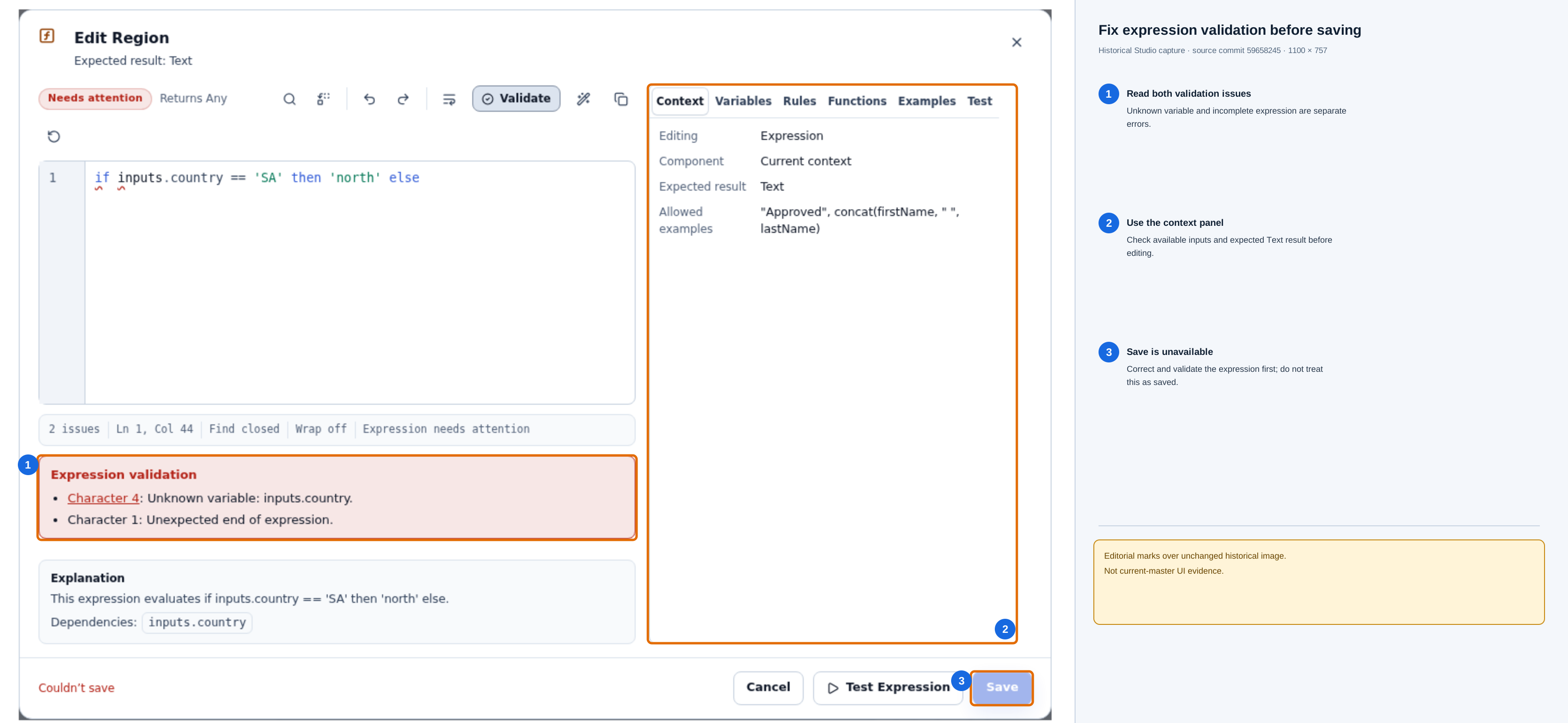
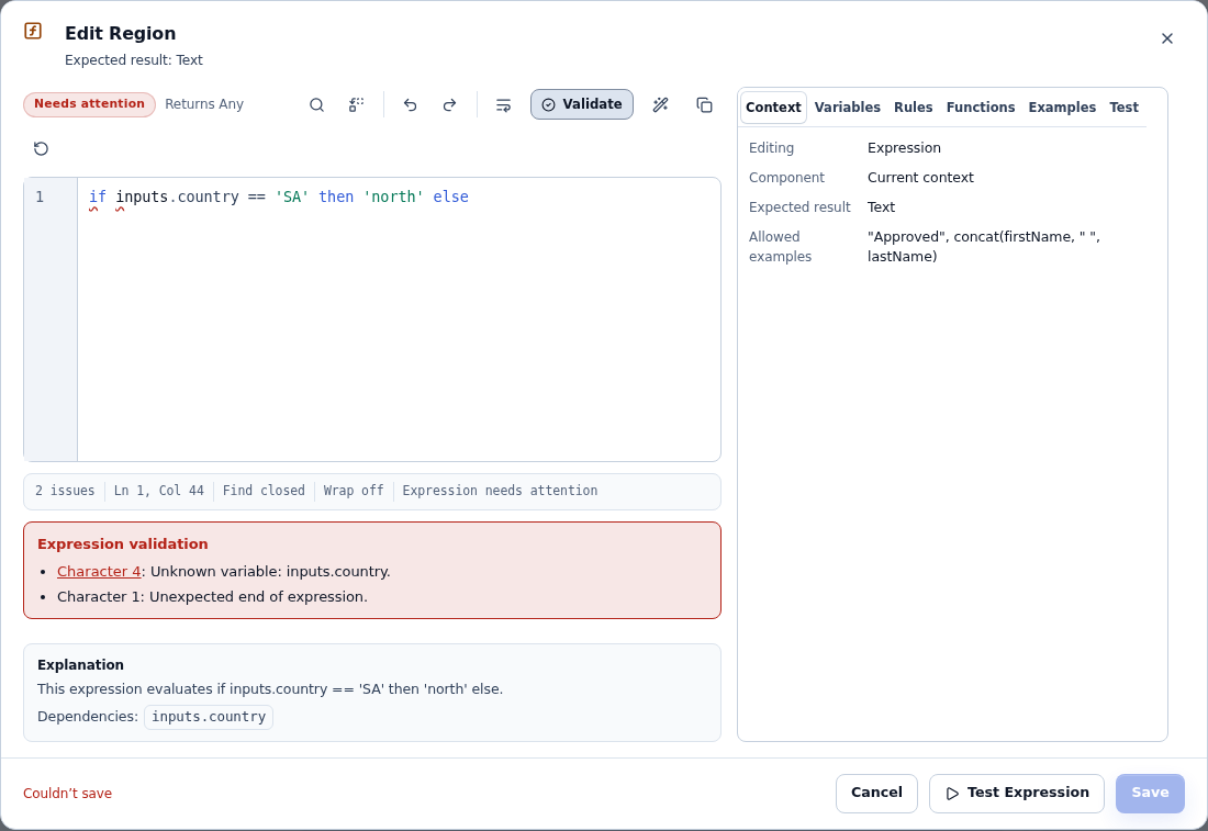
Open the unchanged original expression-editor screenshot. These callouts annotate a historical capture from source commit
59658245; they are teaching guidance, not current-master UI evidence. The visible issues are independent:inputs.countryis not known in this context, and the expression ends before it is complete. Check the available variables, correct the expression, validate again, and save only after the editor reports no issues. -
Click Save. The expression appears in the field as read-only text.
For an enum property, the expression must produce one of the declared values, for example 'north'. Problems are found at two moments:
- At publication, problems visible in the expression itself are refused against that property: a written value that is not declared (
'terrain'), or a result of the wrong kind, such as calculated text for an enum. - When the form runs, a result that depends on the person's inputs can still turn out wrong, for example an undeclared value or an empty value where one is required. The result is withheld, never replaced with the default or the first value, and the control receives the property as an error: "This value could not be worked out."
A Value or Data setting whose value does not fit reaches the control as invalid: "This value does not fit this property."
Expressions in control properties must not change data or depend on time or randomness. They also cannot read computed values of the interface. Publication explains which rule an expression breaks (see Troubleshooting).
Bind to data
- Choose Data.
- Type the data path, for example
locals:regionfor a Local ordata.regionsfor a published list. An empty path shows "Choose the data to show."
The bound value must have the property's type. At publication a mismatch is reported as "The bound value's type does not fit this property."
A Local or Input that holds no value yet (it has no Default value and nothing has set it) is passed to the control as not available. That is the same in Preview and in the published form. What the control then shows is up to the control: the Google Maps sample uses its declared default (for example the road map), and a choice control lets the person make the first choice. If the form needs a definite starting value, give the Local a Default value.
Worked example: an unset map type
Suppose a Service visits form binds Map type to an Enum Local named mapType, and the Local has no default. Until the person chooses a value, the host reports the binding as unavailable. The Google Maps sample treats that state as an unset setting, so its declared default applies. Preview and the published form resolve this setting the same way; Preview remains offline and does not contact Google.
| What the form supplies | What the sample does | What to check |
|---|---|---|
| The Local is unset and the host reports unavailable | Uses the setting's declared default (road map for the sample's map type). | If the form needs another initial type, set a valid Local default. |
| The binding is still loading | Shows the map-settings loading state; it does not substitute the default. | Wait for the source to resolve and check the configured binding if it stays loading. |
| The source reports error or invalid | Shows the source's reason; it does not substitute the default. | Fix the expression or source. Do not hide a failure by assigning a fallback value. |
| A resolved value is outside the property's type or declared range | Shows the setting as invalid; it does not open the map with the default. | Check the Enum's exact declared value or the numeric property's range. |
This rule is specific to the sample's declared setting behavior. It does not make other controls treat unavailable data as a default, and it does not make Google Maps available: the administrator must separately configure and allow that provider for the environment. Design canvas, Preview, and the published form are different modes; use Preview to check a binding, and confirm provider admission separately before expecting a real map.
On the design canvas, a property set from Data or an Expression has no value, because the canvas has no running form: the control shows it as not set (the Region picker shows its regions with none selected), never as loading (SCRUM-5073). Use Preview to see the bound value.
Offer choices
A property can let you configure its list of choices. In that case a separate field appears under the property, named after it, for example Region choices. The choices are stored apart from the selected value, so you can calculate the list and bind the selected value independently. Leave the choices field unset to offer the declared values.
The control decides which sources its choices may use:
-
Expression: an expression that produces a list of values of the property's type. The list can hold at most 1,000 choices, each value must be unique, and for an enum each value must be a declared value. An expression list holds values only: to give choices their own labels or disabled reasons, use Stored data. For example:
if inputs.country == 'SA' then ['north', 'east'] else ['south', 'west']The choices are recalculated when the values the expression reads change.
-
Data → Stored data: rows held in form data.
- Region choices: stored data: the path to the rows, for example
locals:regions. - Value field: the row field stored as the selected value.
- Label field: the row field shown to people.
- Disabled reason field (optional): a row field that, when set, explains why that choice cannot be picked.
- Rows field (optional): when the stored data is an object, the field that holds its rows.
The stored list is checked as a whole: at most 1,000 rows; every row needs a value of the property's type and a label of 1 to 200 characters; a disabled reason is at most 300 characters; and no two rows may have the same value. If any row breaks a rule, the control receives the whole list as an error and offers no choices, never part of the list.
- Region choices: stored data: the path to the rows, for example
-
Data → Records: records of a published record type you can read, searched on the server.
- Region choices: records: choose the record type.
- Value field: the record field stored as the selected value, for example
code. - Label field: the record field shown to people, for example
name.
This option is offered only for properties of a simple type, such as text, an enum, a number, a date or yes/no.
Publishing gives readers no extra data access. Each person who uses the interface needs their own permission to view that data model and its records. For someone without it, the choices cannot be loaded: the control receives the Error state, and no reason is shown to the person. After a refusal the choices are not requested again on that page, so once access has been granted the person needs to reopen the interface. Test the published interface as an ordinary intended user, and ask your administrator to grant data access if they cannot see the choices.
Record choices are read on the server a page at a time: each read returns at most 50 records, and the control is told when more exist. To reach the others, the person types into the control's search, if it offers one, to narrow the list. Do not expect every matching record to be shown at once.
If a choices field was saved with a source the control no longer allows, it shows "… are set in a way this control does not allow. The setting is kept until you clear it." Click Clear choices, then choose an allowed source.
Make one list depend on another
Record choices can depend on up to three other values, for example a city list that depends on the chosen country.
- Under the record choices, click Add dependency.
- In Depends on: record field 1, enter the record field that must match, for example
country. - In Depends on: stored value 1, enter the stored value it must equal, for example
locals:country. - To remove a dependency, click Remove dependency.
What you should see in Preview: the city list stays empty until a country is chosen. Choosing another country loads that country's cities, and answers that arrive late for the previous country are ignored. Nothing is chosen for the person.
A list cannot depend on the value chosen from it, whether directly or through other controls. Publication refuses this with "These choices would depend on the value chosen from them."
Choice states the control receives
The control is told which state its choices are in, and should show each one differently:
| State | Meaning |
|---|---|
| Loading | The list is being worked out or read, or a value it depends on is still loading. |
| Ready | The list is available. |
| Empty | The list has no choices. Dependent lists are empty until every value they depend on is set. |
| Error | The list could not be worked out or read, or it broke a rule (for example two choices with the same value). An invalid list is never shown partly. |
| Unavailable | The list cannot be provided here, for example because the source is not allowed for this property. |
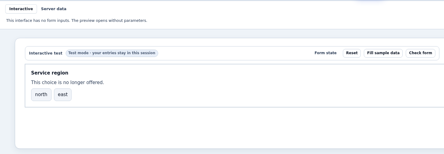
If the selected value is no longer among the choices of a complete list, it is kept and marked "This choice is no longer offered." The person, or the control on their behalf, can then pick a valid choice. Nothing is changed automatically.
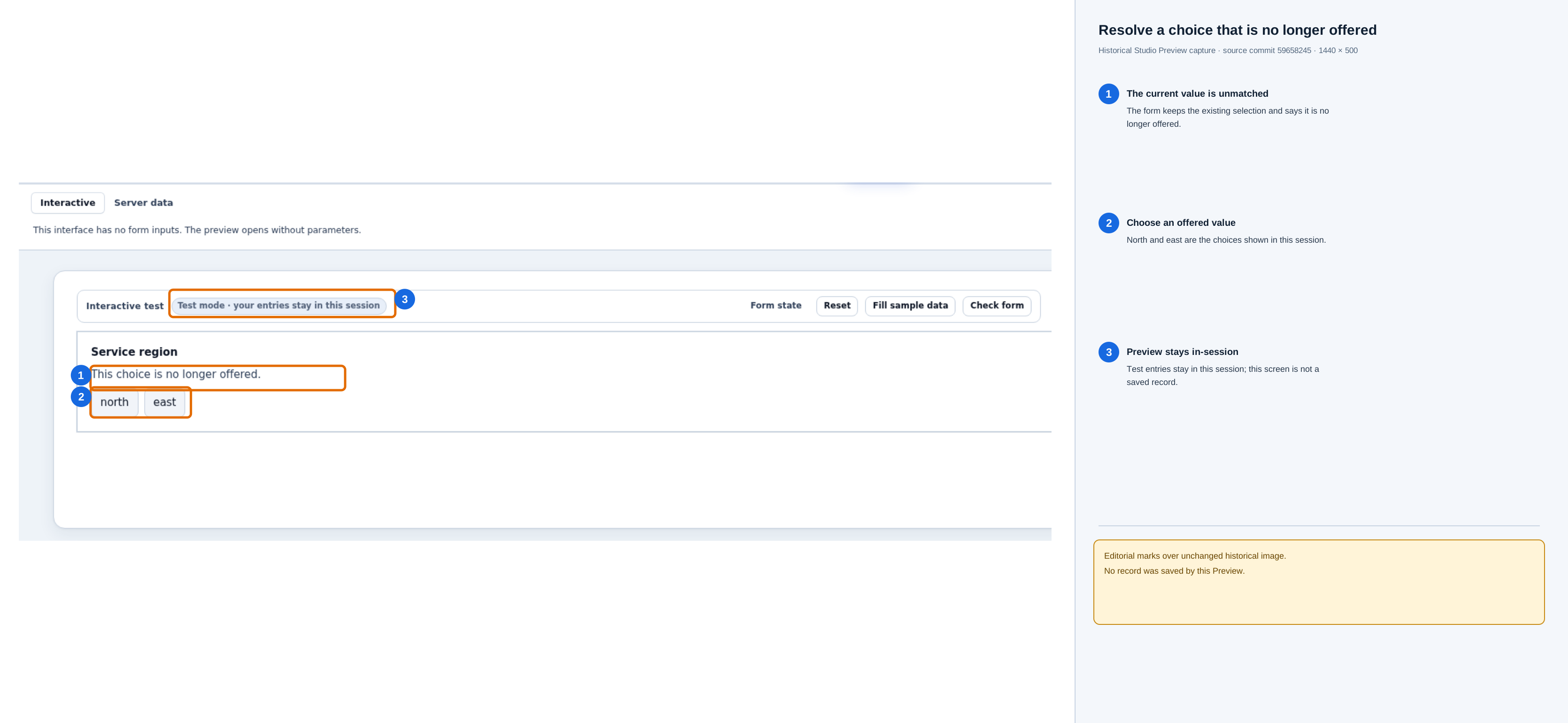
Open the unchanged original Preview screenshot. This is a historical capture from source commit 59658245, not current-master UI evidence. The screenshot shows the generic “This choice is no longer offered” message and the currently offered north and east buttons; it does not display the saved value itself. In this worked example, that saved value is west, which is outside the shown choices. Choose one of the offered values if the form should proceed with a valid selection. Preview entries remain in this session; this screenshot does not show a saved business record.
Let the control change form data
Only one kind of property can be written by a control: a property bound with Data to a declared Local or Input that holds the same type. The Chosen region output writes back Region. Its write is refused in these cases:
- the property is set by Value or Expression;
- the Local is computed (an expression, or a value starting with
=); - the path is a published list (
data.…); - the types differ.
The types that can be written back are text, identifier, enum, whole number, yes/no, date and time. Long whole numbers, decimals, records and references are not written back.
Worked example: keep the chosen region in a Local
- Open the Locals tab and click + Add Local Variable.
- Set Name to
region, Type to Enum and Cardinality to Single. Leave Default value empty. - Select the Region picker on the canvas and open the Properties tab.
- For Region, choose Data and enter
locals:region. - Add a Text input from the Toolbox. Under Data Binding, set Store value in to the
regionLocal, so that you can see the stored value. - Add a Button labelled
Reset. On its Automations tab, click Add automation and choose When pressed. Then click Add step to automation and choose Reset form (under Form Utilities). - Save the draft and click Preview.
What you should see:
- Choosing East in the Region picker changes the Text input to
east. - Typing
southinto the Text input moves the picker's selection to South. - Clicking the same choice again does not mark the form as changed. A control that only repeats the value it was given never makes the form dirty.
- Clicking your Reset button returns both controls to their starting value. It does not count as a choice made by the person, so change automations do not run.
The write goes through the form's normal draft, validation, dirty state, reset, save and cancel. The host never saves anything for the control.
Controls inside a repeater
A control placed inside a Repeater runs once per row, with that row as its context:
- Reading a row field works. For example, in a repeater whose rows each have a
cityfield, set the control's property to Data with the pathcity. Each row's control shows its own row's city. - Writing a row field does not. A row field has no declared type, so an output to it is refused and the row keeps its value. To act on a choice made in a row, connect one of the control's events to an automation instead.
- Choice dependencies and expressions inside a repeater read the row's own values, so two repeaters never affect each other.
Connect a control's events to automations
- Select the control and open the Automations tab.
- Click Add automation. The list offers the events the control declares, by their labels. For the starter control, this is Region confirmed.
- Choose the event, click Add step to automation and pick an existing action, for example Set a field.
- Choose the field to set. In Value, use the event's fields as
event.<name>, for example=event.region. - Save the draft and test it in Preview. The starter control sends Region confirmed when the person focuses a region and presses Enter, or double-clicks it. A single click only selects the region.
What you should see: after you press Enter on West, the field you chose in step 4 contains west.
A map control, for example, might declare an event labelled Visit chosen with a jobId field. You would connect it in the same way: Visit chosen → Set a field, with Value =event.jobId.
Things to know:
- Only events the control declares are offered. A control never offers platform events such as "When a signal is received".
- Events are accepted only right after the person's own action inside the control, or from a registered agent command acting for the person. Loading the form, refreshing choices or resetting the form never sends an event.
- Events are not sent while the control is disabled or read-only.
- Payloads are checked against the declared fields and types. An event with undeclared, wrongly typed or oversized data is dropped, and no action runs.
- Each step runs under the same rules as for a built-in control, including confirmation, protection against running twice, audit, and the server's own permission checks.
- If a new version of the control no longer declares an event, publication refuses the saved automation with "This custom control does not send this event."
Design canvas, Preview and the published interface
| Where | What the control does |
|---|---|
| Design canvas (Designer view) | Shows the control with its Value settings. It never writes form data and never sends events. Expression and Data settings have no value there, so the control shows them as not set; choice lists computed by an Expression or read from stored form data fall back to the control's declared choices (SCRUM-5073). Choices searched from records are still read on the canvas when they depend on nothing else (SCRUM-5128). |
| Preview | Runs as a test form. Outputs change only the preview's own session values, which are never saved. Events run your automation steps under the preview's rules, the same as for built-in controls. The platform gives the control no provider settings, so a control that follows the platform contract (as installed controls must) shows its offline alternative instead of loading an external service such as a map provider. The host does not technically block network requests made by the control's own code. |
| Published interface (Open live, or a user opening it) | Runs for real. Outputs write the form and events run their automations. The control receives a provider's browser settings only when a platform administrator has allowed that provider in this environment and every required setting is filled in. |
Keep secrets out of controls
- A provider's browser settings, such as a map API key or map id, are deliberately visible to everyone who opens the interface, in the browser. They must be restricted at the provider (for example to your site's address) by the administrator who configures them.
- Confidential credentials are kept by the administrator in server-side configuration and never reach the browser.
- Never type a password, token, private key or other secret into a control property, an expression, a choices list, form data or an example. Interface settings are visible to other authors and are copied into published versions and releases.
- Provider settings typed into a property (SCRUM-5123). Some controls also offer a provider setting as a property, for example the Google Maps sample's Maps API key (
apiKey) and Map ID (mapId). A property counts as a provider setting when the control's package declares a provider setting with the same key. When such a property holds a non-empty literal value, the Properties panel shows a warning under it: "This value is saved in the form and travels in exported releases. Leave it empty and configure the provider for each environment instead." The value stays in the form until you clear it. The literal can travel with the release, and the notice alone does not block import. When the receiving server serves that exact pinned control, its import review names the property only (never the value); an unavailable control instead gets the separate unavailable-control result and may block import. Leave the property empty and let the plugin administrator configure the provider on each server (Authorization, Plugins, Providers).
Publish an interface that uses an installed control
Publish as usual. Publication checks every installed control:
- the exact pinned version must be installed and enabled;
- every saved property must be declared, use an allowed source and have a value that fits;
- every expression must follow the rules for control properties;
- every choices source must be allowed and well formed;
- every automation must use a declared event.
Any problem is listed against that control, and nothing is published until it is fixed. For example: "Plugin control: This value does not fit the property: Not one of the declared values."
On success the dialog shows Published interface v1 (or the next version number). If you published from the designer, it offers Open live and Copy link. If you published while opening the live interface, the live interface is already open in a new tab and the dialog offers Copy link.
Publication pins the exact version. The published interface version records the control's plugin version and package digest. That fixes which code runs: a later upload never changes the control a published version uses. It does not guarantee the control stays available. Each time someone opens the interface, the control is offered only if all of these are still true:
- the person may open that published interface version (no plugin rights are needed; see Who may open a published interface);
- the pinned version is still installed, as the current or a retained version;
- the plugin is enabled;
- the platform's global switch for dynamic plugins is not turned off by an operator.
Who may open a published interface
A control needs no grant of its own: whoever may open the published interface may use its installed controls. An administrator lets a person open it in one of these ways (SCRUM-5089):
| Route | What the administrator sets up | Who it suits |
|---|---|---|
| Application access (App Shell) | Publish an App Shell application whose page either references the published interface (a page bound to it) or carries copies of its components. Then, in the workspace's Security area, choose Application access → Manage application access, choose the person's group and the application, review and Apply access. See Let people use an application and choose their starting page. | Ordinary people. They need no workspace membership and no Studio role. |
| Workspace access | A role that may view interfaces (the SCREEN_VIEW permission, set on the person's account under Authorization → Users & groups) and effective Viewer access to the interface in its workspace. |
People who also work in Studio. On a standard installation only the Designer and administrator roles carry SCREEN_VIEW, and they also allow building; the Task Worker and Application user roles do not carry it. |
What application access opens. Apply grants the group exactly the targets the review lists: the App Shell itself and, for a page that references a published interface, that interface too (with what it needs, for example submitting the form). So the group's members can open the App Shell's own link and, for a referenced interface, that interface's own live link as well. A page that carries copies of an interface's components grants nothing on the original interface: application access alone does not grant its live link; without separate workspace access, that link stays Not available to them. A review that cannot list everything a referenced interface depends on is blocked (for example UNBOUNDED_DYNAMIC_DEPENDENCY) and grants nothing.
What workspace access needs. The role permission and effective Viewer access are both required:
- Effective access normally comes from workspace membership (Viewer or above), which every interface in the workspace inherits. An object grant changes one interface's access for a member; it cannot be given to someone who is not a member ("Only principals who can already open the workspace can receive function or object access.").
- A restriction can still refuse: when the grant that wins for the person is None, the live link shows Not available even with membership and the Designer role. The most specific grant wins, so an object grant can override a None on its function. Workspace administrators keep access despite an object None, so that they can recover the workspace.
- Platform administrators (the administrator roles, which hold every permission) receive access to every workspace without membership.
- Membership or an object grant without a role that carries
SCREEN_VIEW, or that role without membership, shows the neutral Not available on the live link, exactly as for a person with no access at all.
Do not give an ordinary person the Designer role only to open a form; use application access instead. Test as the intended person, signed in normally; an administrator's preview proves nothing about them.
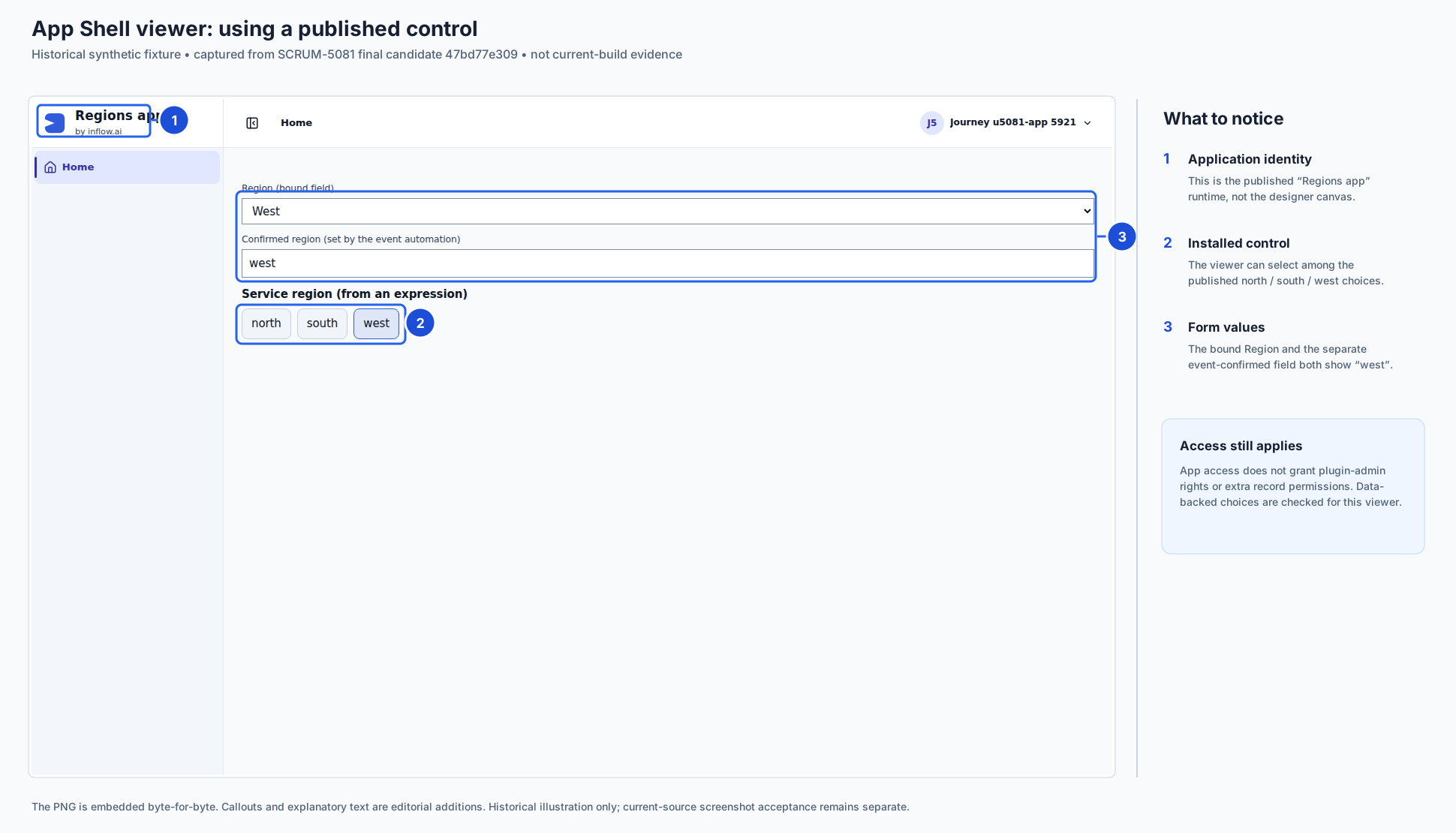
How to read the example: 1 identifies the App Shell application surface. 2 is the installed Region picker and its available choices. 3 shows the value bound to the form and the separate field updated by the control event. In the synthetic example, choosing west updates both the bound region and the confirmation field. The screenshot illustrates a successful app-scoped journey; it does not imply that every control setting or data source is available to every viewer. The viewer's own access still governs record-backed choices and other protected data. It is historical illustration only, not current-build evidence.
Application users. Anyone who can open the interface can use its installed controls. This includes people who open it as users of an application with its own runtime access rules (an App Shell application); they need no extra grant for the control. The server still checks every request against what that person may open and see: choices from stored data need their own read access to that data, and a rule that an expression calls must be part of the application's reviewed access (see Rules called from expressions below).
For these application users, the server offers the control only when it can check everything the control's published settings depend on. It can check:
- fixed values;
- Data bindings to a form Local or Input;
- expressions that read form Locals and Inputs, governed constants, or rules named literally (
rule('key'),rule('key', 2),constant('key'),constants:key,rules:key@2(...)), under the usual rule and type checks; - choices from an expression, from a Local or Input, or from stored records (Data → Records, with filters taken from Locals or Inputs). Record choices need the person's own read access to that data.
Every Local or Input the settings use must itself be one the server can check. A computed Local, a Local whose default is a formula, a Local of an unsupported type (such as a Record Local), or an undeclared Input is left out for application users. So is any control that depends on it.
Rules called from expressions. When you publish, every rule that an installed control's property or choices expression calls is recorded with its exact key, and its version when you write one. When an administrator reviews the App Shell's access for a group, the review lists each of these rules next to the interface, together with what the rule itself needs (for example the data model a query rule reads). Applying the review lets the group's members run those rules from this application. The rule runs as the person who opens the page, exactly like a Call a rule action; it never runs with your rights as the publisher.
- All seven kinds of rule that an expression can call are allowed: constant, expression, decision table, query, integration, AI task and record (create/update/delete). An integration, AI task or record rule is marked in the review: it calls an external system, calls an AI model or writes records, and it runs whenever the page renders or a value changes. This holds for every person who views the interface (workspace users and application users alike), and the rule always runs under that person's own rights. Prefer a button action for anything that should happen once.
- A rule other than a constant, expression or query rule needs at least one declared input, so that the server knows when to run it again.
- Write the rule key (and version, if any) literally. A key or version computed from other values (for example
rule(inputs.ruleKey)) cannot be reviewed: publishing warns PLUGIN_CONTROL_RULE_CALL_UNBOUNDED, and the App Shell's access review is blocked until you change it. - The review records the rule version it saw, and shows it on the rule's row. If the rule is published again, or you change the version you call, the rule is refused for application users until an administrator reviews the application's access again. The same holds for a rule the expression's rule calls in turn, and for Call a rule actions and rule data sources in the application.
- Use only the built-in functions in such an expression. A function the server cannot check (for example one from a plugin) cannot be reviewed for application users, and publishing warns as for a computed rule key. That review says so, for example "Rule visits_map: version changed from 1 to 2".
- Before the access is reviewed, and for people outside the reviewed group, the control is not available to them and the rule is never run.
- Rules called from ordinary (non-control) interface expressions are not covered: application users do not get those expressions evaluated. Earlier versions of this guide said that rule calls worked for application users; that was true only for people who also had workspace access.
If a property is bound directly to stored data (for example data. or record.), an expression reads another kind of state directly (such as process variables or outputs), or the control depends on a Local or Input that is left out, the server leaves the control out for application users only. Its place shows a small Not available badge, and the rest of the interface still works. A preview by an author or administrator does not prove that application users can use the control, so test as an intended application user.
Open pages check this again regularly and when the page becomes visible again. If the control is disabled, revoked or switched off, it is withdrawn and shows Control not available within a short time, not instantly.
Upgrade to a newer control version
The upgrade described here applies to plugin packages that contain only interface controls (browser code). A package that also contains server code cannot be upgraded while keeping its earlier version. If your control comes from such a package, ask your platform administrator how an upgrade affects your interfaces before it happens.
When an administrator upgrades a plugin, new designs use the new version. Already-published interface versions keep the version they were published with: the earlier version is kept as a retained version, and an administrator cannot release it while a published interface version still uses it.
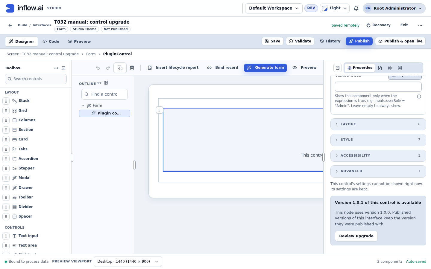
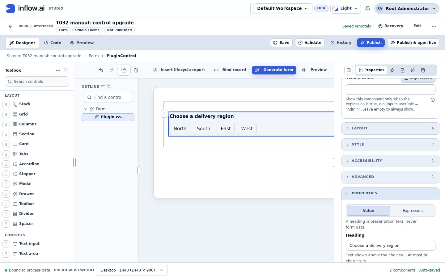
A draft keeps its pinned version until you upgrade it. Until then, the designer shows the control as unavailable: the designer offers only the current version of a control, so on the design canvas and in Preview the control's place shows Control not available ("This control cannot be shown right now. Its settings are kept."). This is expected: the control is not broken, its settings are kept, and published interface versions that pin the earlier version keep showing it to people. After Upgrade to … the control appears again on the canvas.
-
Select the control. While the panel cannot show its settings, it says "This control's settings cannot be shown right now. Its settings are kept." It also shows Version … of this control is available.
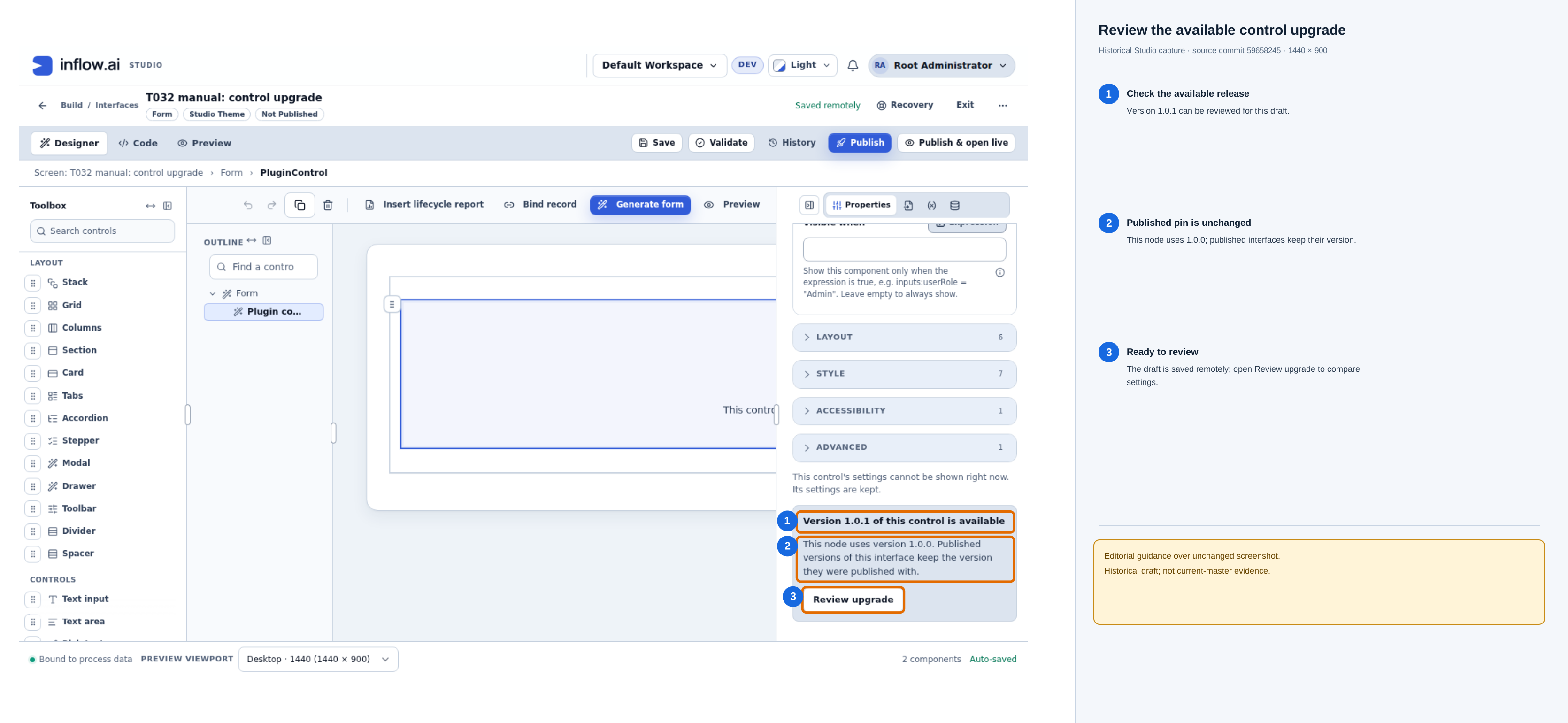
Open the unchanged original upgrade-available screenshot. This historical capture from source commit
59658245shows the selected draft using 1.0.0 and an available 1.0.1. The panel states that already-published interface versions keep the version they were published with. This screenshot is already saved remotely. An unsaved current editor document can also be reviewed; save first if you want a remote recovery point. Publishing remains a later, separate action. -
Save the draft first if you need a remote copy of your current edits; upgrade review can also preview the current editor document without saving. If you see "Save the interface first, then review the upgrade," the preview context is missing (for example, the draft ID or current document). Restore that context before reviewing. This review does not publish the interface.
-
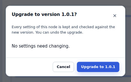
Click Review upgrade. The dialog Upgrade to version …? checks your current settings against the new version.
-
Read the result:
- "No settings need changing." means you can upgrade.
- A list such as
Setting "zoom" is no longer offeredorAction for the event "…" is no longer offeredmeans the upgrade is blocked with "Resolve the listed settings first, then upgrade." See When the upgrade is blocked.
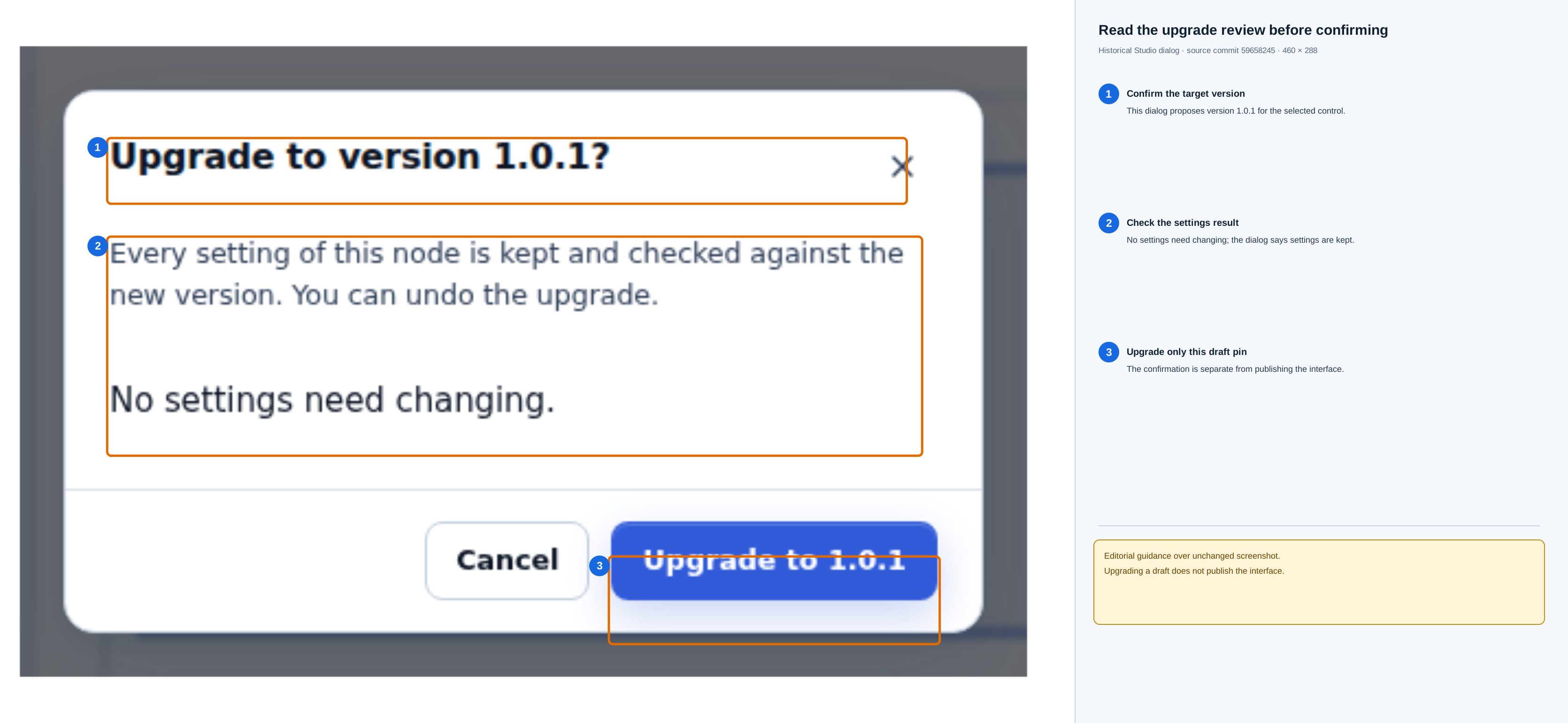
Open the unchanged original upgrade-review dialog. The displayed result says that no settings need changing and that settings are kept. Read this result before choosing Upgrade to 1.0.1; this action changes the selected control's draft pin, not a published interface.
-
Click Upgrade to …. This changes only this control's pin, keeps every setting, and can be undone. Publish the draft when you are ready. Upgrading never changes a published version.
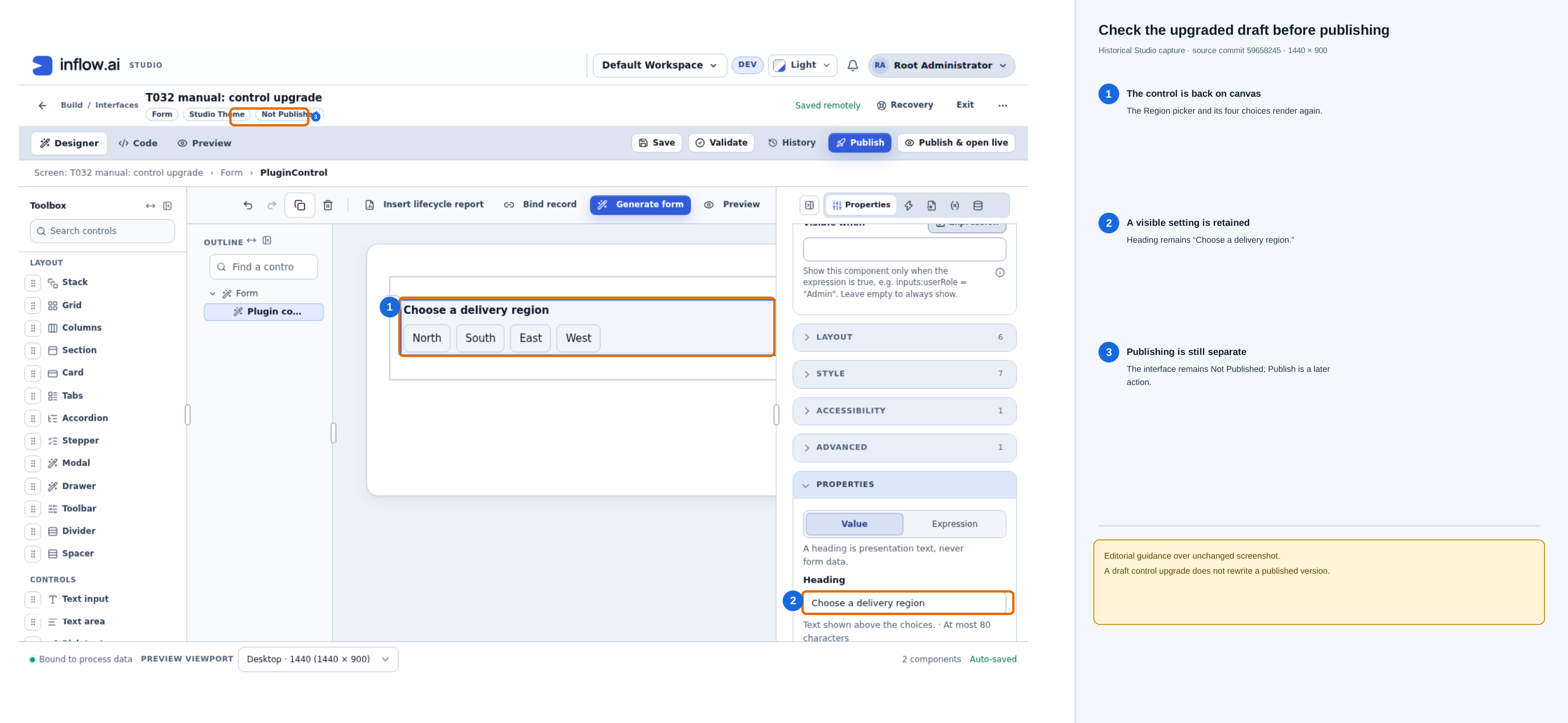
Open the unchanged original post-upgrade screenshot. The picker is visible again, its Heading value remains, and the interface still shows Not Published. Review the draft and publish only when ready; upgrading a draft does not rewrite an already-published version.
If the dialog says "The current version changed. Close and review the upgrade again.", the administrator installed another version meanwhile. Review again.
When the upgrade is blocked
While a control pins an earlier version, the Properties and Automations tabs cannot show that control's settings, so you cannot change the listed settings there. Replace the control with the current version instead. You only read the saved settings; you do not write code.
-
Read the old control's saved settings. Switch to the Code view. It shows the saved draft as JSON. Click Search and search for the control's key (for example
starter-region-picker) orPluginControl. In the matching block, read and note, without typing anything:- its
"id"; - each entry under
"properties":{"mode": "LITERAL", "value": …}is a Value,{"mode": "EXPRESSION", "expression": "…"}an Expression, and{"mode": "BINDING", "bind": "locals:region"}a Data binding; - each entry under
"options"(its choices sources); - each event handler, named
onplus the event key (for example"onRegionConfirmed"for the eventregionConfirmed), whose"do"list holds its automation steps.
Copy JSON or Download JSON keeps a copy for reference. If you do not edit the interface, or prefer not to open the Code view, ask your platform administrator or another author of this interface to give you these settings.
- its
-
Switch back to Designer. Right-click the old control and choose Select parent, so the container that holds it is selected. (While the old control itself is selected, the Toolbox entry is greyed out, because a control cannot hold another control.)
-
From the Installed controls group in the Toolbox, add the control. The new copy uses the current version. Drag it next to the old one if needed.
-
Set its properties in the Properties tab from your notes, using the same Value, Expression or Data for each (for example Data
locals:region), so that the form keeps the same data. Skip the settings the new version no longer offers. -
On the new control's Automations tab, recreate each event automation from your notes, for the events it still offers.
-
Select the old control and click Delete the selected component (Del) in the designer toolbar, or press Delete. Its settings and automations are removed with it. Undo (Ctrl/Cmd+Z) brings it back if you need to check something.
-
Save the draft, check the result in Preview (the choices, the value written to the form and each event's automation), and publish when it works.
What you should see: the form behaves as before, except for anything the new version no longer offers. No published version changes until you publish.
Alternatively, an author comfortable with editing the Code view can remove only the listed entries there and then review the upgrade again.
You cannot publish a new version that still pins a retained version. Upgrade the control first. Rolling back to an earlier published interface version that pins a retained version is allowed.
Move an interface to another server
A release of an interface carries only the control's identity, version and digest. It does not carry the plugin package, its installation, credentials or provider settings.
When an administrator reviews the release on the target server, the Interface controls section shows each pinned control as Available here or Not available here, with a reason:
| Reason shown | What to do |
|---|---|
| This exact plugin version is not installed on this server. | The target administrator installs the same package version. |
| This plugin version is on this server but not active. A plugin administrator can turn it on. | The target administrator chooses Enable on the plugin (a package left pending by an earlier version), or applies the staged upgrade. |
| The installed plugin version does not include this control. | Install the package version that contains the control. |
| The installed control uses a different control contract version. | Install the package version the release pins. |
| The plugin is installed here but disabled, or interface controls are switched off. | The target administrator enables the plugin. If an operator has turned off dynamic plugins for the whole server, enabling the plugin does not help; the operator must turn them back on. |
A release with any unavailable control cannot be imported, and nothing is imported partly.
When a control is not available
If the pinned control is not installed, has been disabled, has been revoked, is switched off for the whole server, or cannot load, the control's place shows Control not available, with "This control cannot be shown right now. Its settings are kept." The rest of the interface keeps working, and your saved settings are not changed.
While the page is still reading which controls it may show (for example on the first load of an application page), the control's place shows a loading indicator, not Control not available (SCRUM-5089). Control not available appears only once that answer says the control cannot be shown, or the answer fails.
- Disabled, revoked or switched off: when the administrator makes the control available again, open pages pick that up and the control appears again with the same settings.
- Failed to load (for example a network problem while its code was loading): it does not retry by itself. Save your work, then reload or reopen the interface once the problem is fixed.
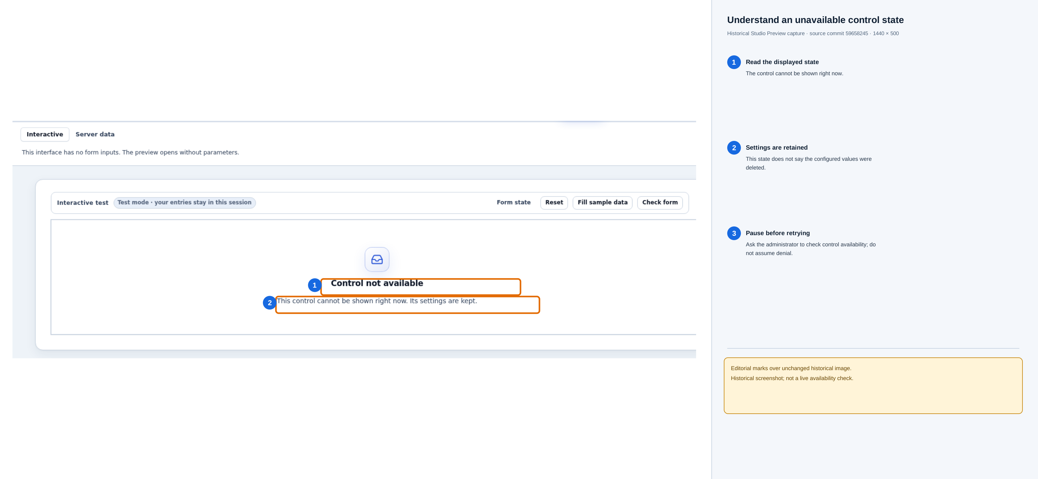
Open the unchanged original unavailable-control screenshot. This historical capture from source commit 59658245 shows the control unavailable in this Preview session while its settings remain kept. It is not a current availability check, does not establish permission denial, and does not show the settings being deleted. Ask the platform administrator to check whether the installed control is available before trying again.
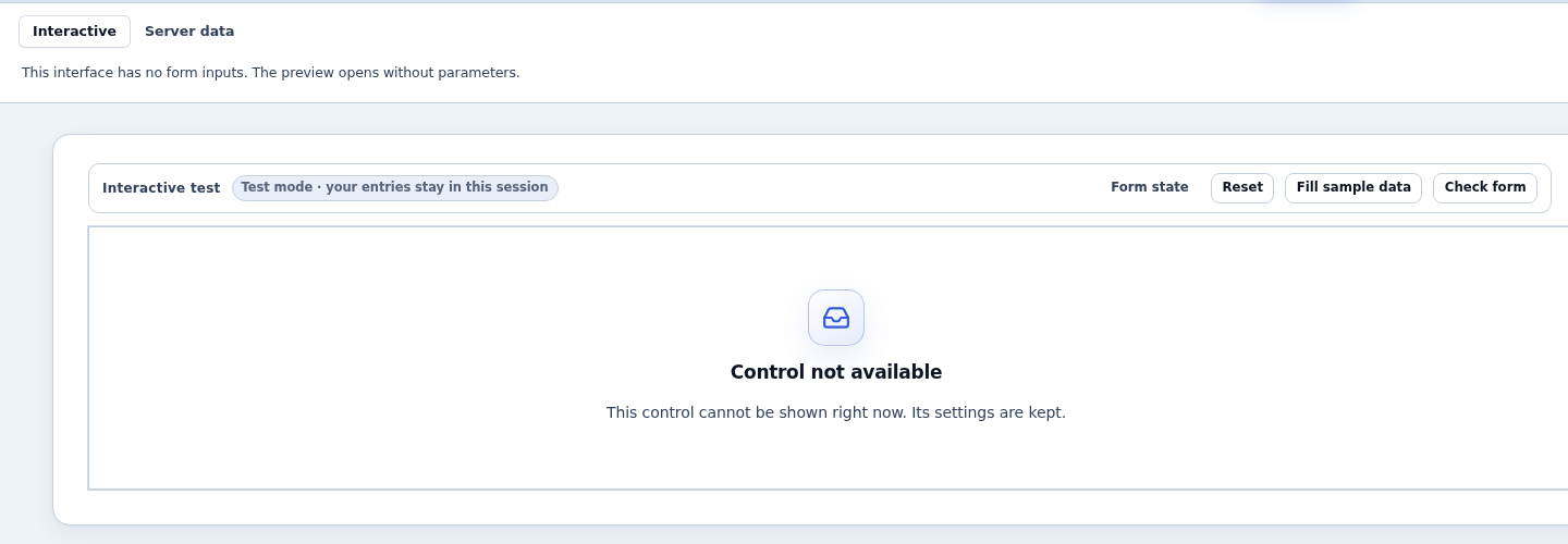
People using a published interface see the same Control not available state. It does not explain why, because they may not be allowed to know. A plugin administrator can see the reason. The designer's recovery features described next are for authors only.
Recover unsaved work
The designer keeps a local recovery copy in this browser while you edit. Know its limits:
- Copies expire 24 hours after the last edit. Signing out or changing account clears them where browser storage is available, and each browser tab keeps its own copy. Use Export current work in the Local recovery panel for anything you need to keep longer.
- If the server draft changed since your copy was made, saving is blocked until you compare and resolve the conflict. The exact choices and save step are in the conflict section after the recovery steps.
-
If the designer closed before you saved, open the interface again and click Recovery in the designer toolbar. While a change could not reach the server, the header says, for example, Saved locally · Could not save the draft.
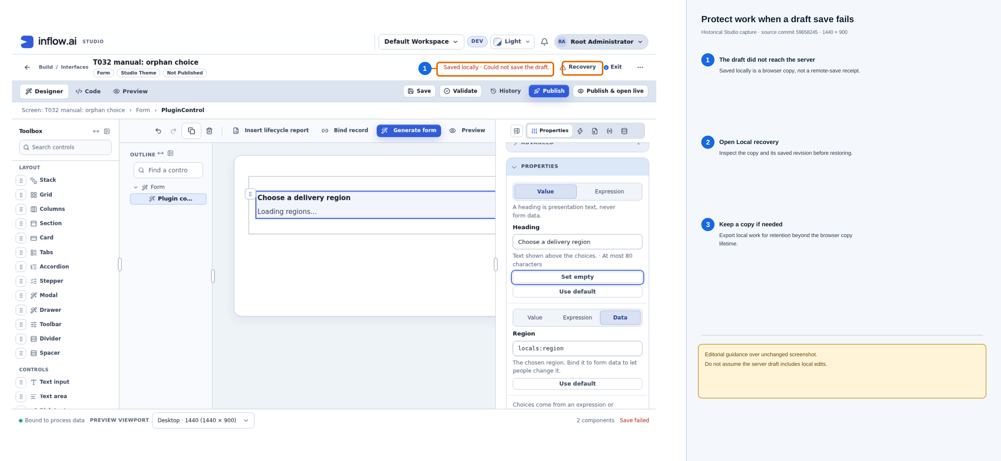
Open the unchanged original local-save warning screenshot. This historical capture from source commit
59658245shows that the browser holds local edits but the draft did not save remotely. Open Recovery and inspect the copy before continuing; do not treat the local status as a remote-save receipt. -
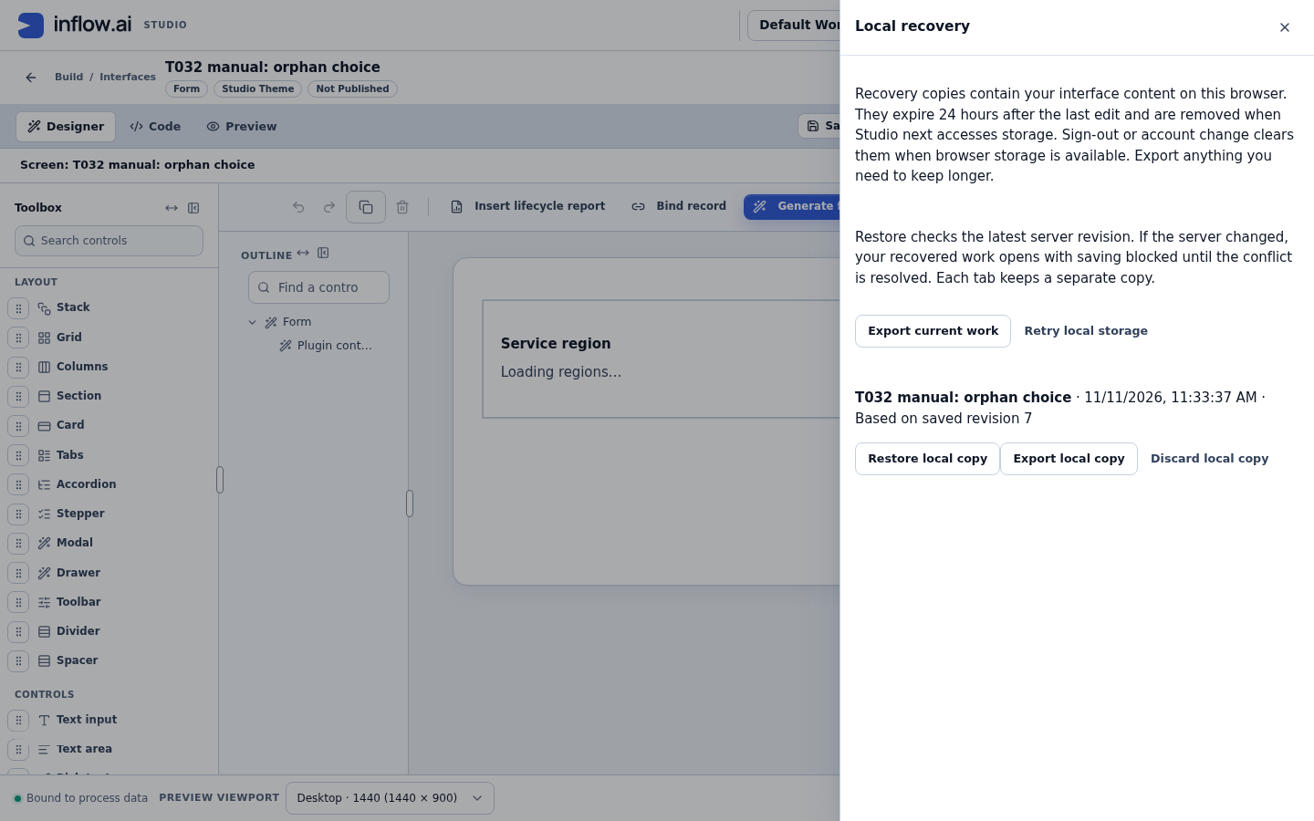
Each copy shows its title, time and "Based on saved revision …". Click Restore local copy to continue from it, Export local copy to download it, or Discard local copy to delete only this browser's copy.
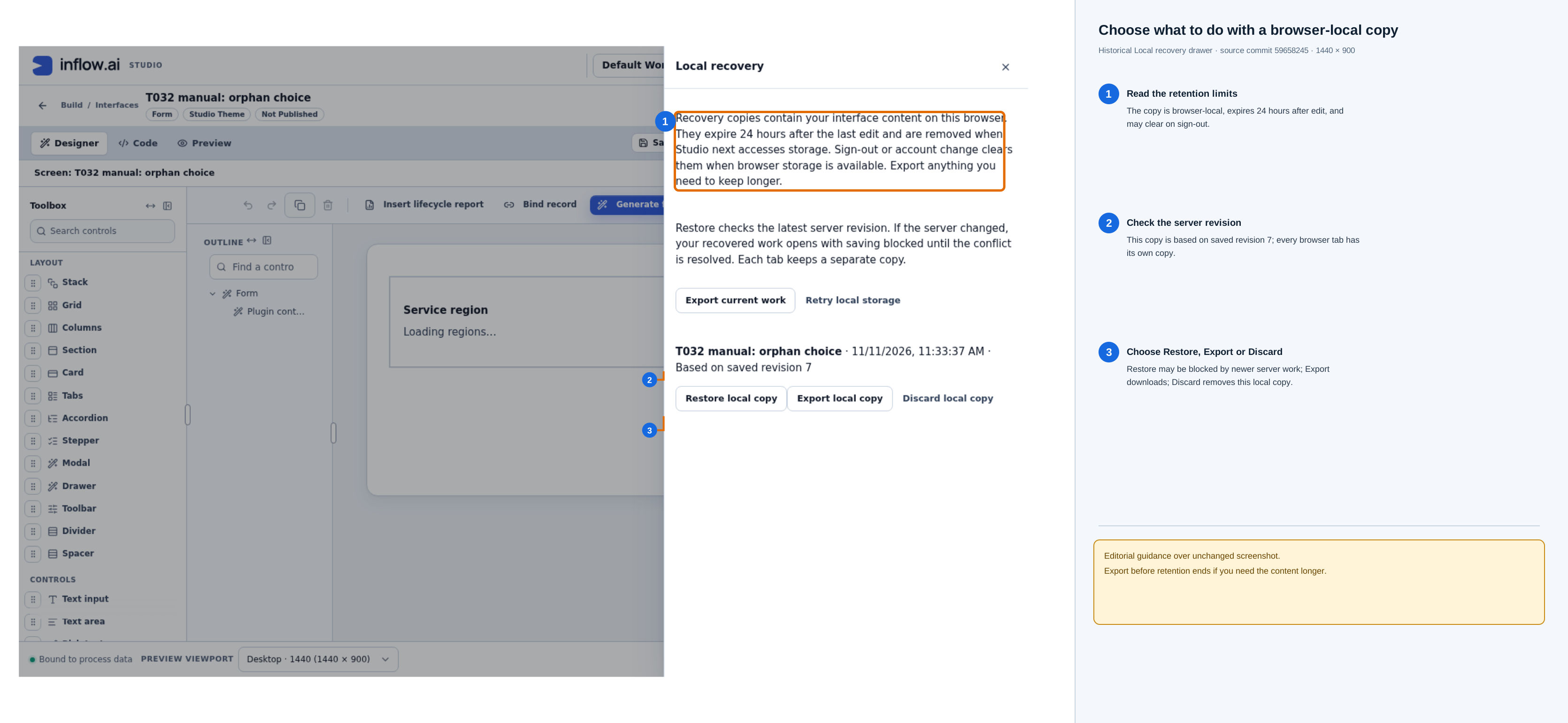
Open the unchanged Local recovery drawer screenshot. The listed copy is based on saved revision 7. Restore local copy continues from that browser copy; Export local copy downloads it; Discard local copy removes only that local copy. A newer server revision can block saving restored work until you resolve the conflict.
-
If the copy "Includes unapplied inspector fields", for example an unfinished JSON value, restoring brings back their text without applying it. Finish the text so it is valid, or click Discard field draft: … to drop just that field.
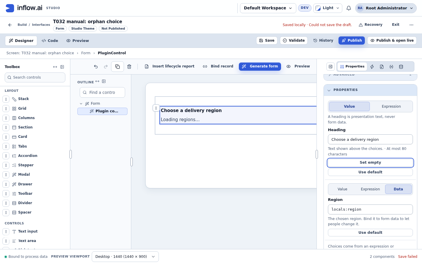
What you should see: the restored interface, with any unfinished JSON value back in its field and still marked invalid until you complete it.
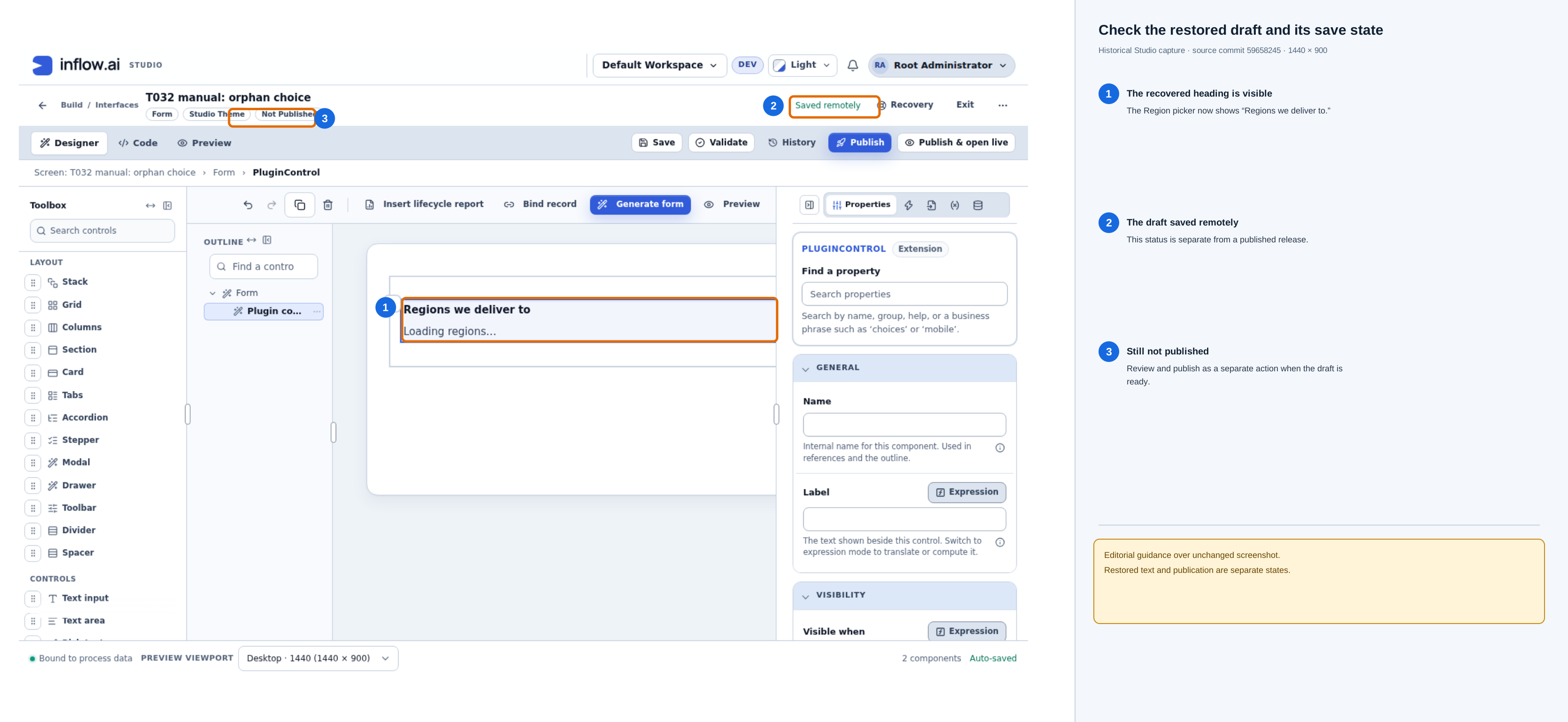
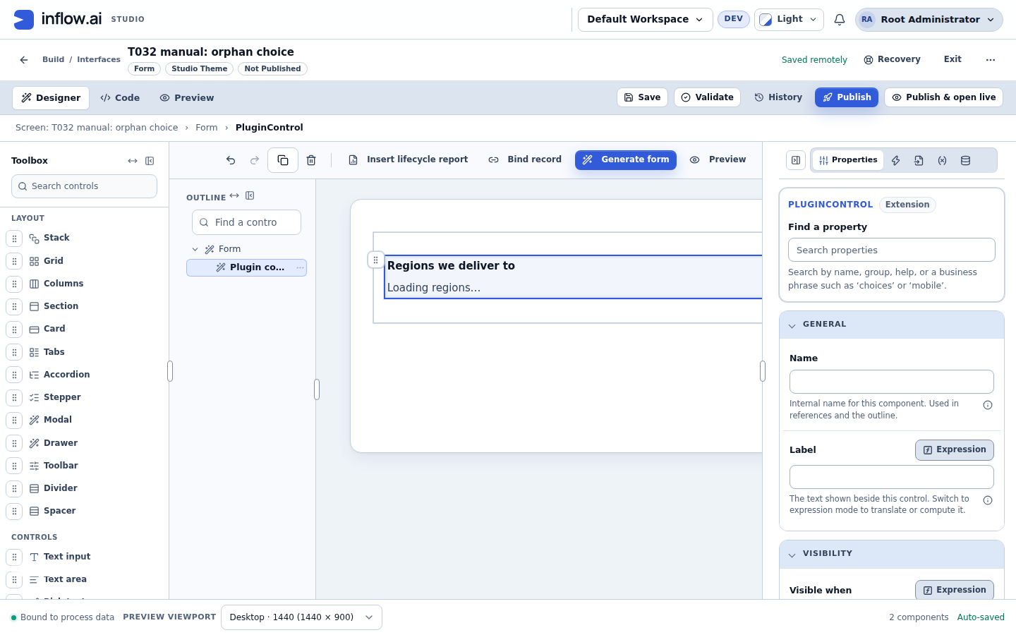
Open the unchanged post-restore screenshot. In this example, the restored heading reads Regions we deliver to and the draft status says Saved remotely; the interface remains Not Published. A remotely saved draft is not a published version.
If restoring the copy later hits a conflict
Use this section only if saving the restored document is blocked. Click Compare and resolve. The dialog compares the Common base, Your local work, and Current server versions for each changed area. It automatically merges changes that do not conflict; each conflicting row needs your choice.
| Choose | Use it when |
|---|---|
| Use local | Keep the change from the browser recovery copy. |
| Use server | Keep the latest saved server change for that item. |
For a fictional Heading example, if the common base Heading is Service region, your local copy says Regions we deliver to, and the server now says Delivery regions, choose the wording you want for that Heading. Make a choice for every conflict. Read the automatic merges, unresolved count, and any issues; Save resolution stays unavailable until every conflict has a choice and the result is ready. If the local editor changes or the comparison becomes stale, compare again against the latest versions. Save resolution writes the chosen result to the draft; it does not publish the interface. Use Export all versions first if you need a downloadable copy of the base, local, and server documents.
Accessibility, theme and right-to-left layouts
- Each control sits in a named region. Assistive technology announces it by the control's label, and the region reports when it is busy loading.
- If a control that has keyboard focus fails while it is shown, focus returns to its region rather than to the top of the page. If the control is withdrawn (for example disabled by an administrator) while it has focus, the region is replaced by the Control not available panel and focus is not yet moved there; this is a known limitation.
- Controls receive the interface's theme colours and the text direction of their position. They follow light, dark and custom themes and right-to-left layouts without extra settings.
- A control whose main view is not accessible on its own, such as a map, must also offer a keyboard-operable list of the same items, kept in step with the selection. The starter control shows its choices as such a list.
- Property labels, descriptions and enum labels can be translated by the control. The designer shows them in the interface's language when a translation exists.
When you review a form, check the control with the keyboard alone, at a narrow width and in a right-to-left language if your users need one.
Troubleshooting
| You see | Where | What it means and what to do |
|---|---|---|
| No Installed controls group | Toolbox | No installed, enabled control is available, or you cannot edit this interface. Ask a plugin administrator. |
| Entry greyed out with "… does not contain child controls." or a similar reason | Toolbox | The selected container cannot hold it. Select another container. |
| "This control limits how this property can be set." or the control's own reason | Properties | The control allows only some sources. Use one that is offered. |
| "A record cannot be entered as a value; set it from data or an expression." | Properties, Value mode | Bind the property to data, or use an expression. |
| "Not one of the declared values." / "… (not available)" in the drop-down | Properties | The saved enum value is no longer declared. Pick a listed value, or choose Use default. |
| "Expected a date like 2026-11-06." and similar type messages | Properties | The saved value does not fit the type. Correct it. Your text is kept until you do. |
| "Enter an expression." / "Choose the data to show." | Properties | The Expression or Data source is empty. Fill it in, or click Use default. |
| "Plugin control: This value does not fit the property: …" | Publish | A Value setting does not fit. Correct it. The rest of the message says why. |
| "This property's expression is not a valid expression." | Publish | Correct the expression in the expression editor. |
| "A custom control property cannot run a function that changes data." | Publish | Move that function to a button, a submit action or a rule. |
| "This expression reads an input this interface does not declare, or reads one by index." | Publish | Declare the input and read it by name (inputs.name). |
| "A custom control property cannot read a computed value of this interface." | Publish | Use the inputs or data that value is computed from. |
| "The bound value's type does not fit this property." | Publish | Bind data of the property's type, or convert it with an expression. |
| "This custom control is not installed and enabled in this version." | Publish | Ask an administrator to enable it, or choose another control. Your settings are kept. |
| "This control does not declare a property named '…'." | Publish | Remove the setting, or upgrade to a version that declares it. |
| "This custom control does not send this event." | Publish | Remove the automation, or use an event the control offers. |
| "These choices would depend on the value chosen from them." | Publish | Make the list depend on another value. |
| "Two of this list's choices have the same value." | Publish | Remove the repeated choice. |
| "This choice is no longer offered." | Preview or live form | The saved choice is not in the current list. Pick another one. |
| Control not available | Canvas, Preview or live form | On the canvas the message starts at the node's start edge and stays in view while you scroll the canvas (SCRUM-5080). On the canvas and in Preview of a draft: the control pins an earlier version kept only for published interfaces; review the upgrade (see Upgrade to a newer control version). Otherwise: the pinned version is not served here (not installed, disabled, revoked or switched off), the person is an application user and the control's settings depend on something the server cannot check for them, such as a property bound directly to data. or record., or a computed Local (they see a Not available badge; see Publish an interface that uses an installed control), or the code failed to load (reload the interface). Otherwise ask an administrator. Your settings are kept. |
| A Data-bound property shows as not set on the canvas | Design canvas | Expected: the canvas has no form data (SCRUM-5073). Check the bound value in Preview. |
| The control writes nothing back | Preview or live form | The property is not bound with Data to a declared, non-computed Local or Input of the same type. See Let the control change form data. |
Reference for agents and automated tests
| Element | data-agent-id |
|---|---|
| Installed controls group | interface.designer.toolbox.plugins |
| Toolbox entry (also a command) | interface.designer.toolbox.plugin.<pluginId>.<controlKey> |
| Property field | interface.designer.props.plugin.<propertyKey> (state: literal, expression, binding, empty or invalid) |
| Source switch and options (options are also commands); only for editable properties with more than one allowed source | ….mode, ….mode.LITERAL, ….mode.EXPRESSION, ….mode.BINDING |
| Value, Edit expression, Use default, Set empty | ….value, ….expression.edit, ….reset, ….set-null |
| Choices field | interface.designer.props.plugin.options.<propertyKey> |
| Upgrade review | interface.designer.props.plugin.<nodeId>.upgrade.review |
| Running control region | the node's agent id (state: loading, ready, unavailable or idle) |
| Output and event commands while running | <node agent id>.output.<outputKey>, <node agent id>.event.<eventKey> |