
Optional technical reference. This material is for developers, integration specialists and platform administrators. For the consultant lesson, read the practical guide.
Preserved from source baseline
d4587c7c0e073e58c2d430342f65ac55dd701bf4; source/static examples retain their stated scope. They are not new runtime verification or required consultant setup steps.
1. Getting started
Start with the kind, workspace and lifecycle
A Form captures/works data, an App Shell provides the persistent application frame, and a Dashboard organizes analysis. The ordinary wizard has Type, Placement, Details and Review; App Shell adds Shell template and Options, and an entry point that already fixes the kind can omit Type. Placement chooses the owning business function/context, not an extra field to paste into the closed ISL document.
Designer and Code edit the same draft. Preview exercises a configured draft and may access admitted real sources. Published Open Live is a different boundary. The examples use a synthetic people-ops fixture so those distinctions are visible before the first business mutation.
Example UIAI-CH01-01 — Create the right kind of leave interface
Scenario and inputs. Nadia needs a single employee data-entry surface for the fictional leave request, not yet a multi-page application frame. She can author interfaces in the intended people-ops workspace and knows the actual business-function placement allowed there.
Procedure. Start New interface and select Form. Follow Placement, enter the readable title Leave request and a valid available key, then inspect Review before creation. If the entry point already selected a kind, inspect that kind instead of expecting an identical step count. Record the actual returned draft ID/key/revision. The later shell will reference a published form through its own page contract.
Expected result. The draft has a Form-specific document/root shape and the selected native ownership. It is not an App Shell simply because a layout Container appears inside it. Title and key have distinct purposes: display wording can change while machine references retain their supported grammar.
Failure and recovery. A conflicting key or missing placement is a real authoring issue. Choose an available key or reconcile the existing draft through the supported wizard. Do not force-create a duplicate, insert ownership fields in arbitrary JSON, or assume a page visible in another workspace may be authored here.
Sources. Actual kind cards/steps, create command boundary.
Example UIAI-CH01-02 — Inspect a saved form before changing it
Scenario and inputs. Nadia opens an existing authorized leave form after Sara asks where employees enter the reason. Her first goal is orientation. She should not change the form merely to discover how the interface is structured.
Procedure. Identify the header's current draft/save state, then locate the Toolbox, Outline, Canvas and Properties inspector. Select the reason field through its semantic label/outline entry and compare its stored bind target in Code. Switch to Preview only with an admitted fixture and understand that configured sources may issue real reads. Use published Open Live separately when the selected publication is what you intend to inspect.
Expected result. The same underlying node is understandable across visual and code views. Current tabs are Designer, Code and Preview; older screenshots using Live describe a prior label. Selecting a field or reading its property does not establish that any business record was saved or task completed.
Failure and recovery. If access is unavailable, preserve the neutral state and do not issue hidden object requests. If unsaved changes already exist, preserve them and resolve their owner before navigating away. An old screenshot cannot establish the current node's source or authorization state.
Sources. Current view labels, control metadata.
What an interface is
An interface is a screen your workspace presents to a user. There are three kinds:
- Form — a single data-entry surface with typed controls and validation (e.g. a purchase request).
- App Shell — a published application frame with persistent navigation, configured regions and linked pages (e.g. a workspace home).
- Dashboard — reports, metrics, and charts over your data sources.
Every interface is a tree of components: a screen holds containers (Cards, Sections, Columns…), containers hold controls (Text, Select, a Progress Bar…). You build that tree visually; behind the scenes it is stored as a JSON document (the screen language, covered in Part II).
The designer tour
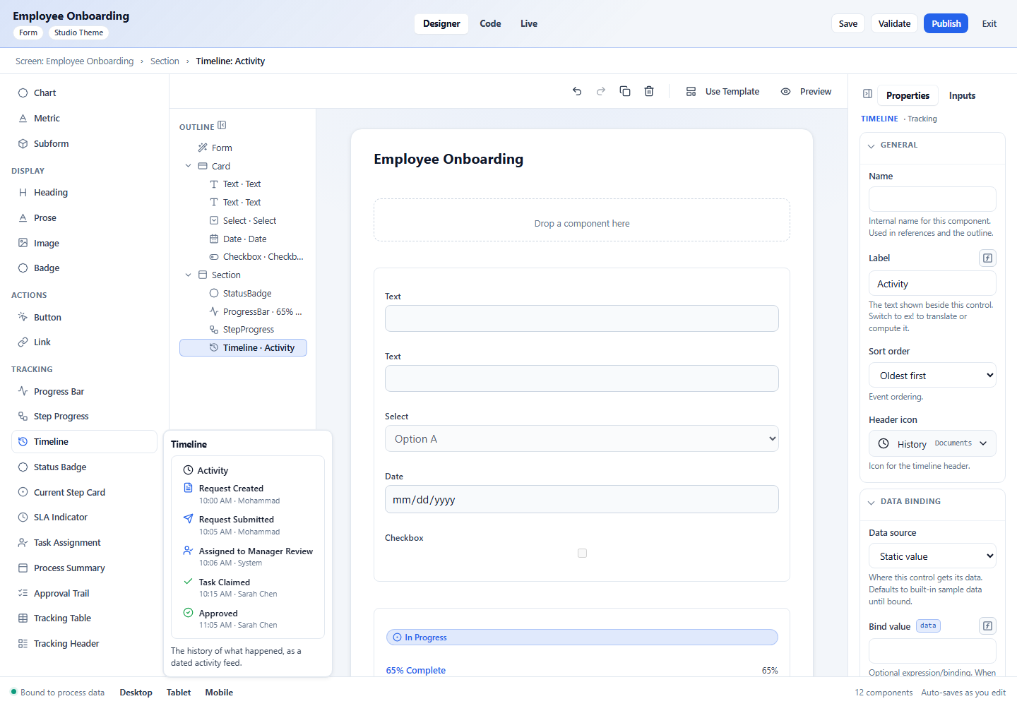
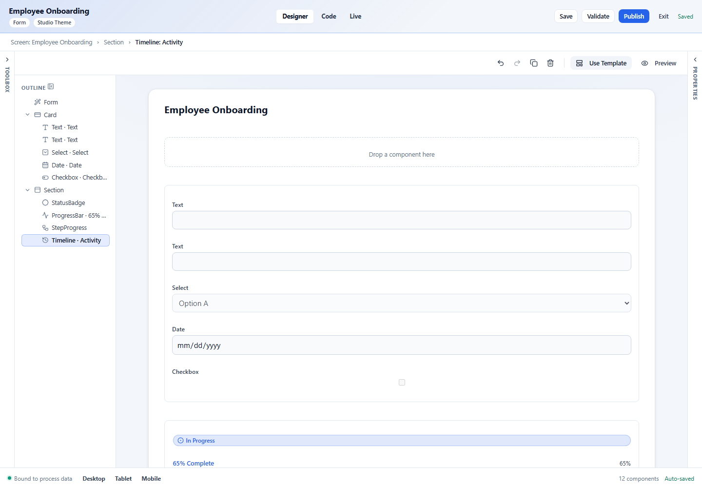
The designer is four working areas plus the header.
Header
- Title and two chips showing the interface type (Form) and theme (Studio Theme).
- Designer / Code / Preview — switch between the visual builder, the raw JSON, and an interactive preview.
- Save, Validate, Publish, Exit — save your draft, check it for problems, publish a version, or leave.
- A status on the far right (“Auto-saves as you edit” / “Saved”).
Toolbox (left)
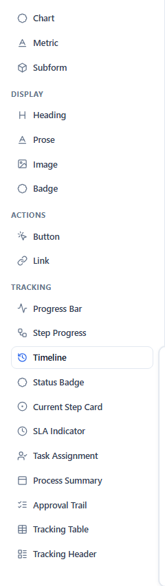
The palette of everything you can add, grouped into Layout, Controls, Data, Display, Navigation, Actions, and Tracking. A search box filters it. Hover any item for a help card with a live preview and a one-line description.
Outline
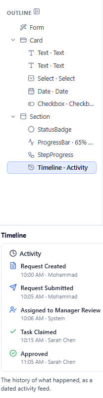
The structural tree of your interface. Each row shows the control’s icon, its type and label, and small badges when a node is data-bound, has an expression, or is conditional. On hover, each row reveals actions to move up / down, nest / un-nest, and delete. You can multi-select rows (Ctrl/Cmd-click to add, Shift-click for a range) and edit shared properties for all of them at once. See Building interfaces.
Canvas (center)
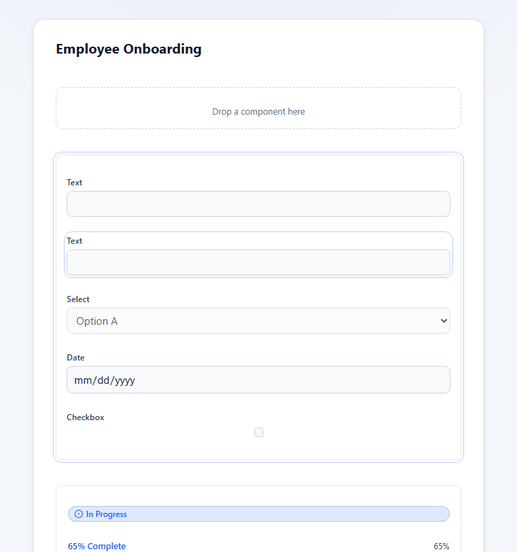
A live rendering of the real interface. This is where you drop and select components. A breadcrumb above it shows the path to the selected component (Screen › Card › Field), a small toolbar offers undo / redo / duplicate / delete plus Use Template and Preview, and the footer switches the device size (Desktop / Tablet / Mobile).
Properties (right)
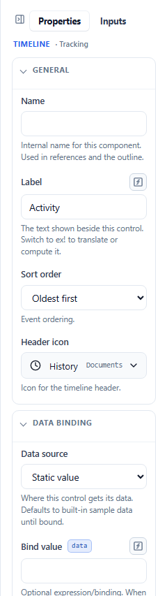
Everything about the selected component, organized into groups — General, Value, Data Binding, Validation, Visibility, Behavior, Layout and Style, plus control-specific groups. Tabs at the top switch between Properties, the interface’s Inputs, and (on Forms/App Shells/dashboards) a Theme tab. Fields that accept a formula show a small ƒx toggle to switch to an expression. Covered in Properties & data.
Collapsing panes
Any of the three side panes can be collapsed to a thin rail (click the small collapse icon in its header) to give the canvas more room, and restored by clicking the rail. Panes are also width-resizable by dragging their edge. Your collapsed layout is remembered.
Next: Building interfaces →