
Optional technical reference. This material is for developers, integration specialists and platform administrators. For the consultant lesson, read the practical guide.
Preserved from source baseline
d4587c7c0e073e58c2d430342f65ac55dd701bf4; source/static examples retain their stated scope. They are not new runtime verification or required consultant setup steps.
2. Building interfaces
Build structure deliberately
The Form root is structural. Add a Section/Card/Stack where appropriate and place typed answer controls inside a supported container. An Outline move changes ownership as well as visual position; an opaque data/runtime control is a leaf insertion target, so neighboring content belongs to its parent. Save/reload before assuming a rearrangement is retained.
Responsive settings describe layout at specific breakpoints. They do not change a record's type, grant access or make a server-paged query run locally. The two cases below separate normal construction from recovering a structural mistake.
Example UIAI-CH02-01 — Arrange a clear leave-request form
Scenario and inputs. Nadia has an authorized new Form draft in people-ops. Mohammad needs first day, last day and a reason. The fixture uses14–18December2026, but account IDs and the saved draft coordinate come from the reader's environment.
Procedure. Select the Form root, add a section titled Leave details, then add two Date controls and one TextArea inside it. Give each a meaningful label and internal name. Use the Outline and breadcrumb to confirm the actual parent-child tree rather than relying only on where a box appears on the Canvas. Configure the declared bind targets, required validation and sensible spacing, save, then reload the same draft.
Expected result. The three controls are children of the intended section and retain their properties/IDs after reload. Input values follow declared destinations; arrangement alone does not persist a leave record. The interface remains understandable on the supported device widths.
Failure and recovery. If a control was inserted next to the wrong parent, move it through the supported Outline/Canvas operation and inspect Code before saving again. Do not duplicate the field to hide the misplaced original or add children inside an opaque runtime region that will not render them.
Sources. Insertion target rules, leaf/opaque control sets, property schema.
Example UIAI-CH02-02 — Recover from a layout move and check device sizes
Scenario and inputs. Nadia accidentally moves the reason field outside its Leave details section. There are unsaved changes and a second responsive view must also be checked. This exercise concerns the owned draft; it is not permission to restore an unrelated worktree or replace another author's document.
Procedure. Inspect the selected node and breadcrumb, use Undo for the mistaken move, then verify the tree in Outline/Code. Reapply the intended change deliberately if needed. Switch the designer's device size and inspect the supported responsive overrides for the actual container. Check that labels, field order and validation messages remain usable rather than testing only a large empty Canvas.
Expected result. Undo/redo and the document model describe the same structural edit. Responsive layout changes presentation while the node identity, declared type and value destinations remain stable. Saving retains the intended revision rather than an accidental duplicate field.
Failure and recovery. If a save conflicts with another revision, re-read/reconcile rather than overwriting. If navigation would discard dirty work, use the native stay/discard decision. Do not assume a phone preview is runtime accessibility evidence, or repair a missing child by editing an unsupported raw advanced property on a leaf control.
Sources. Designer edit surface, responsive layout source, conditional draft save.
Creating a new interface
From a workspace’s Build → Interfaces area, click New Interface. A short wizard opens:
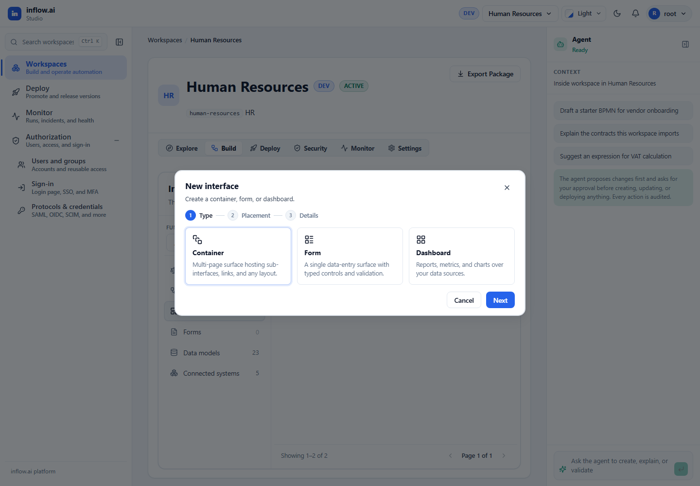
- Type — pick App Shell, Form, or Dashboard.
- Placement — where it lives.
- Details — give it a Title. A stable key is generated from the title automatically (you can adjust it).
- Review — inspect the choices and choose Create interface to open the draft.
App Shells also have a Shell template step and shell-specific page/options
choices. The designer route is
/workspaces/:workspaceKey/design/interface/:draftId; published runtime uses
/workspaces/:workspaceKey/interfaces/:screenKey/live/:pageStub?.
Adding components
Two ways, both real mouse actions:
- Click a toolbox item — it’s inserted into the current selection (into a selected container, or after a selected control), or at the end if nothing is selected.
- Drag a toolbox item onto the canvas and drop it on a highlighted drop zone.
Newly added components are selected automatically, so you can set their properties right away.
Arranging components
On the canvas
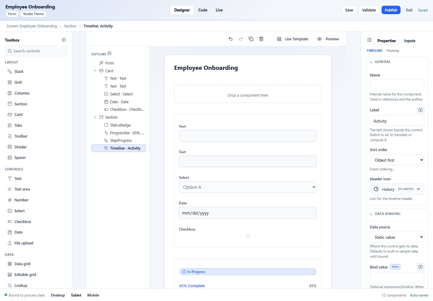
Select a component by clicking it (a calm selection ring appears). Use the canvas toolbar to duplicate or delete it, and undo / redo any change.
In the outline
The outline is the fastest way to restructure. Hovering a row reveals its actions:
- ↑ / ↓ — move the component up or down among its siblings.
- Outdent / Indent — move it out of its parent, or nest it into the previous sibling.
- Trash — delete it.
Keyboard equivalents work when a row is focused: Alt+↑/↓ to move, Alt+←/→ to un-nest / nest, and Delete to remove.
Multi-select
Ctrl/Cmd-click rows to toggle them into a multi-selection, or Shift-click for a contiguous range. The Properties panel then shows only the properties those components share, and changing any value applies it to all of them at once — great for setting the same width or style across many fields.
Selecting via the breadcrumb
The breadcrumb above the canvas (Screen › Card › Field) is clickable — jump to any ancestor of the current selection with one click.
Device sizes
The footer switches the canvas between Desktop, Tablet, and Mobile so you can check responsive behavior. Layout containers (Columns, Grid) reflow at smaller sizes.
Generated form actions
Generate form places its primary Submit button in the form’s Actions section. The default button is sized to its label, with normal padding; it does not fill the section width. Designer, Preview, and the published Live form show the action in that same section. You can use the button’s width and alignment properties when a different layout is intentional.
If a form has no authored submit action, a host that supports form submission can provide its usual fallback action. Human-task forms present completion in their task action area.
Next: The control library →