
Optional technical reference. This material is for developers, integration specialists and platform administrators. For the consultant lesson, read the practical guide.
Preserved from source baseline
d4587c7c0e073e58c2d430342f65ac55dd701bf4; source/static examples retain their stated scope. They are not new runtime verification or required consultant setup steps.
4. Properties & data
Understand what a property changes
The current inspector's ordered groups include General, Value, Data Binding, Validation, Visibility, Behavior, Columns Fields, Search Filters Sort Paging, Actions, Layout, Style, Events, States, Accessibility and Advanced. A control shows the applicable subset. Store value in and Store selection in are destination editors, not storage services; use the actual declared target type.
Prefer the current generated locals: spelling for local state; supported legacy aliases do not justify inventing new namespace grammar. Scalar expression capability is editor-specific, and composite builders own their structured mappings. A visibility condition is presentation, while native access decides whether the protected control/request may exist.
Example UIAI-CH04-01 — Capture an answer and derive a display
Scenario and inputs. Nadia's form declares a Text reason and a local result value used by a later admitted action. She wants Mohammad to understand what he entered without confusing an editable answer with a computed display or persisted record.
Procedure. Select the TextArea and use Store value in to choose the declared reason input, such as ri:reason. Configure a Heading/Prose/Metric only through that display's supported value/expression editor when showing derived information. For an action result, choose an explicit local destination such as locals:result. Inspect completion choices and the actual type; a text label resembling a path is not a declared binding.
Expected result. Input edits update the intended value destination, while the display reads the supported expression scope. A local action result belongs to the browser/session surface and is not automatic database persistence. Property modes remain explicit rather than interpreting every string inside structured data as an executable expression.
Failure and recovery. Fix an unknown target or type mismatch in declarations/the native picker. Do not use a display control's defaultValue as a substitute for a live calculated value, or move confidential data into a local literal to bypass source permission. Inspect actual action state before treating locals:result as success.
Sources. Destination labels and property modes, supported local/input paths, expression scope.
Example UIAI-CH04-02 — Explain validation and conditional visibility
Scenario and inputs. The synthetic form asks for a reason and should explain an invalid date range without losing Mohammad's edits. Nadia also wants an optional explanatory section to appear when a declared field calls for it. Neither condition is a grant to read a protected record.
Procedure. Configure required/date-order validation through the actual field editor and supply clear messages. Use completion for the declared input names in the Boolean condition, then test both a valid and invalid typed fixture. For optional explanatory content, configure Visible when through its supported expression surface. Inspect the stored contract and distinguish static values, Boolean expressions and structured builder-owned mappings.
Expected result. Validation communicates a specific repair and visibility controls appropriate explanatory presentation. Native server authorization still admits protected reads and effects independently. A hidden section is not a security implementation, and a denied action should not remain as a visible permission-error control.
Failure and recovery. Unknown identifiers or a wrong expression result type stay errors instead of silently becoming false. Correct the scope/type or native mapping. If a source capability is unavailable, treat that separately from denied access; do not retry unauthorized catalogs or replace their results with fake empty data.
Sources. Actual property schema, client expression behavior, visibility policy.
Select any component and the Properties panel (right) shows everything about it, grouped for scanning.
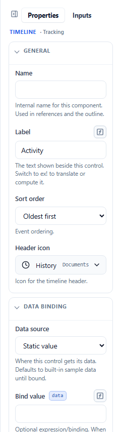
Property groups
- General — the component’s Name (an internal reference used in the outline and expressions) and its Label (the text shown to the user).
- Value — the field’s default/computed value, placeholder and control-specific choices.
- Data Binding — where a control gets its data (a static value, a data model, a process, a task, or an API result).
- Layout — width, column span, alignment, gap, padding, height, margin, and responsive behavior.
- Style — background, text color, border, corner radius, font size/weight, text align.
- Behavior — read-only / disabled and control-specific behavior switches.
- Validation — Required and Validations for input controls.
- Visibility — the Visible when condition (show the component only when a condition holds).
Additional control-specific groups include Columns Fields, Search Filters Sort Paging, Actions, Events, States, Accessibility and Advanced; empty groups are omitted. The current source group order and input validation definitions are authoritative.
The panel’s top tabs switch between Properties, the interface’s Inputs catalog, and — for Forms, App Shells, and dashboards — a Theme tab.
Static values vs. expressions
Most fields take a plain value. Fields that can also be computed show a small ƒx toggle. Switch it on to write an expression instead of a fixed value — for example, a default of “today”, a label that concatenates two fields, or a visibility condition.
Expressions use friendly namespaces:
ri:field— a form/rule input (the value of another field on this interface).locals:name— local scratch state.data.entity.field— a data-model value.
Example visibility condition: show a State field only for US addresses →
ri:country == 'US'.
Binding an input’s value — “Store value in”
For input controls, the Data Binding group asks where this input’s value is saved. Pick or type a target:
ri:…— a form/rule input.data.…— a data-model field.
For ordinary editable fields, use compatible declared input/data destinations. locals:… is a local result destination for supported rule actions, not the normal field store target.
The Lookup / bind picker suggests known targets from the interface as you type. The type of the target must match the control.
The expression editor
Any expression field can open a full expression editor — a modal with:
- a code area with autocomplete and inline validation,
- an assistant side panel with tabs for Context, Variables, Functions, and Examples (click any to insert it),
- a Test tab where you supply sample values and run the expression to see its result (including a color swatch preview for color expressions),
- Validate feedback (a badge + inline issues) and a plain-language explanation of what the expression does and what it depends on.
Validation & conditional visibility
- Required / Validations live in the Validation group; set a field required, or add a validation rule.
- Visible when (Visibility group) hides a component until its condition is true — used for conditional sections and dependent fields. It is presentation, not an access grant.
Server authorization still applies to every protected read and mutation. Controls and requests denied by current effective access are absent; an inaccessible direct link uses the shared neutral unavailable state. Do not replace this with a visible permission-error control or use a visibility expression to bypass it.
Colors and icons
- Color fields use a combo input: pick a theme token or enter a specific color; a swatch previews it.
- Icon fields open a searchable icon dropdown backed by the Inflow Business Icons library (use the current searchable catalog), used throughout the tracking controls.
Next: Tracking controls →